
Arival Bank (Mobile)
Dashboard
I led the redesign of the third version of the mobile banking app, reworking the information architecture, navigation, and action hierarchy so the things people need most sit up front.
 Goal
Goal The bank had always been web-first, and the mobile app lagged behind. The task was to bring it up to the same level: simplify interactions, group information logically, and build a foundation for growth on iOS and Android.
 Result
 Before the redesign, active mobile users accounted for only 20–30%. After launch, the share grew to around 50%, and people started using the app for everyday operations. New sections shipped on top of the updated structure, and the app finally felt like the same product as the web version.
 Personal challenge
 I was the sole designer on the mobile app while also working on the web product. Every decision had to balance user experience, business goals, and platform constraints, and keep both products consistent.
Workflow
- 1 Research and audit
Gathered feedback from users, support, and stakeholders, and went through analytics, in-app behavior, and crash reports. A UX audit of navigation, flow, hierarchy, and accessibility surfaced the main pain points: confusing onboarding and inconsistent interaction patterns.
- 2 Direction
Set the objectives: better usability and performance, smoother onboarding, room for new scenarios, and consistency with the brand, all within iOS and Android guidelines. Turned these into hypotheses and tested them with quick prototypes, keeping platform limits in mind.
- 3 Design and prototyping
Rebuilt the navigation model and information structure, then prototyped the key screens and widgets. Tested on real devices and with beta users, refining tap zones, motion, and microinteractions, and kept the design system in sync across both platforms.
- 4 Handover
Prepared mobile-optimized Figma components, documented behavior and assets, and worked with developers through design reviews and implementation checks to hold quality across the build.
Design solutions
- 1 Navigation and architecture
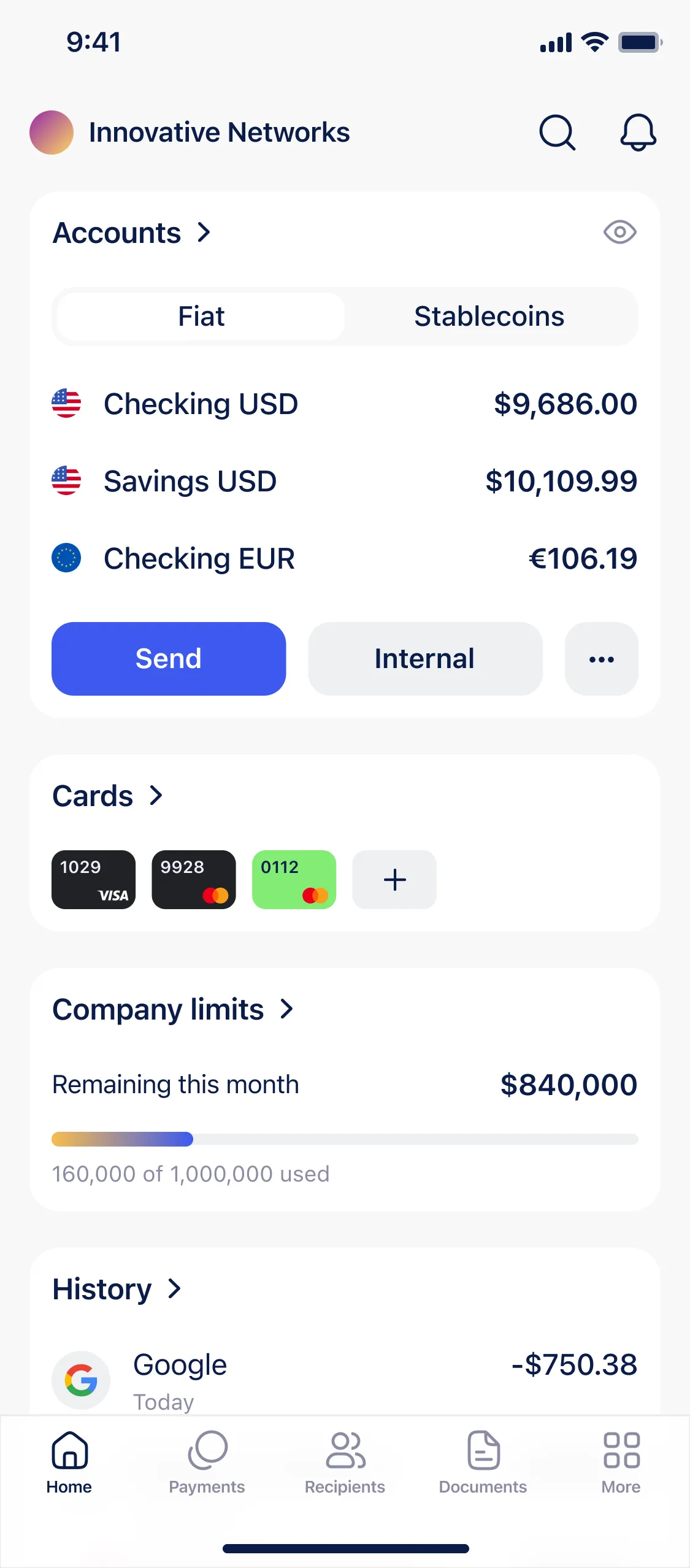
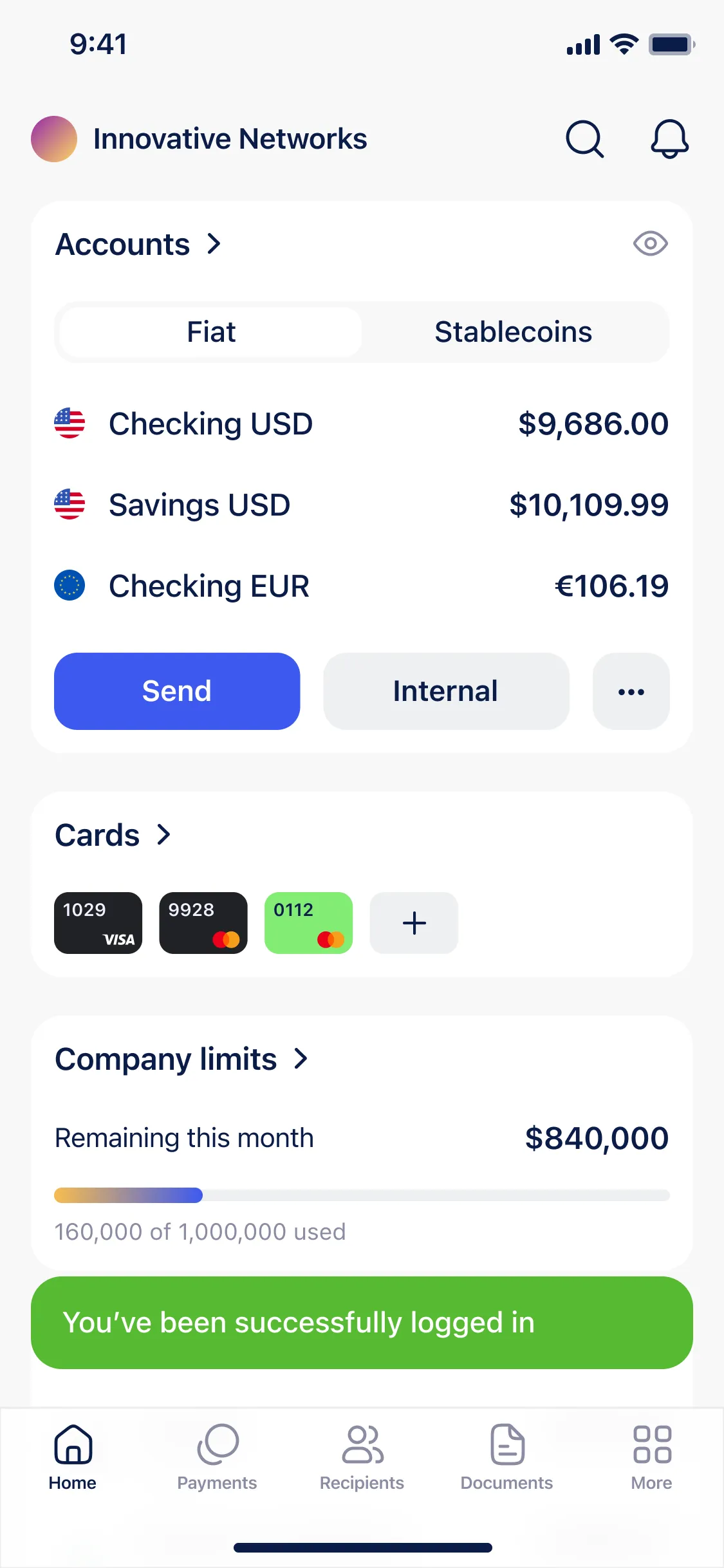
I reorganized the primary sections into a tab bar: Home, Payments, Recipients, Documents, and More, with everything secondary tucked under More. The company name sits in the top-left corner and opens the profile, where users can check their plan or switch between companies without logging in again.
- 2 Home screen structure
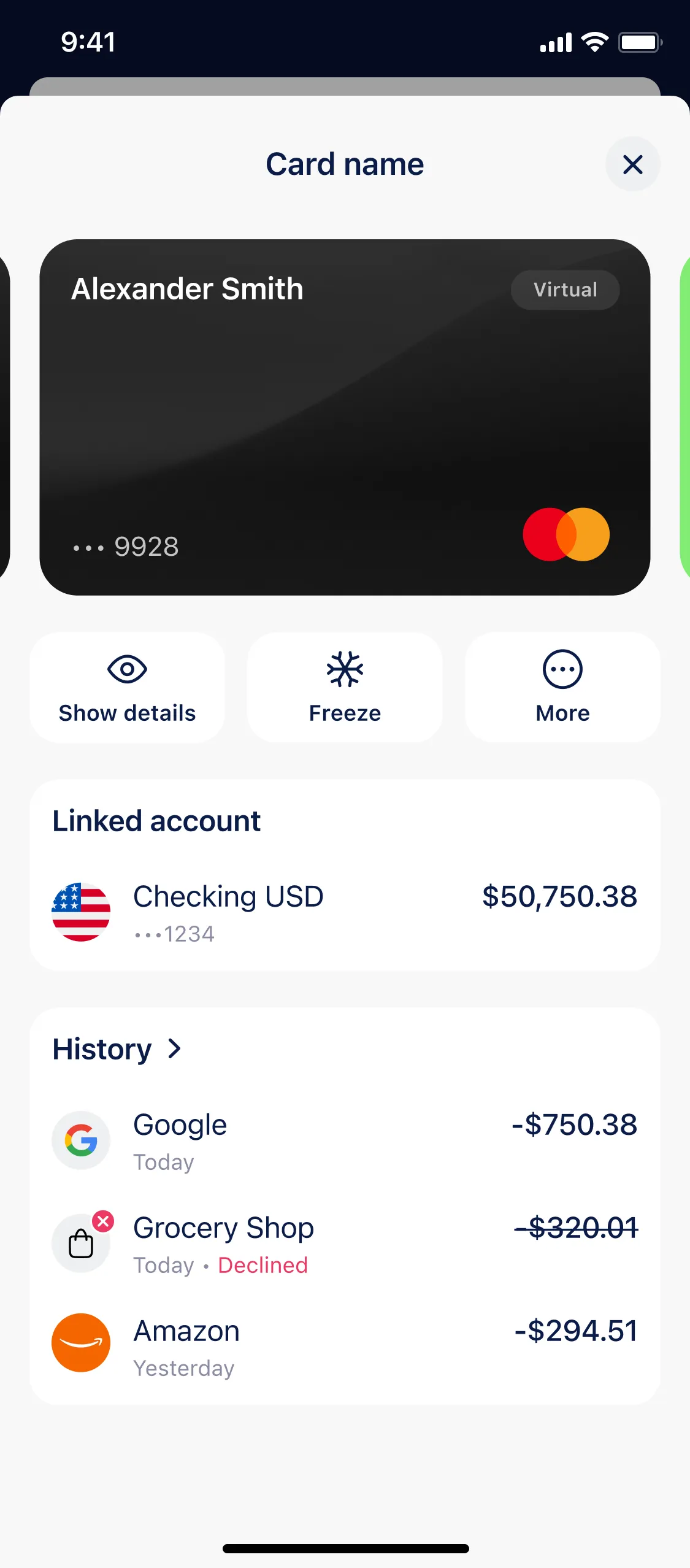
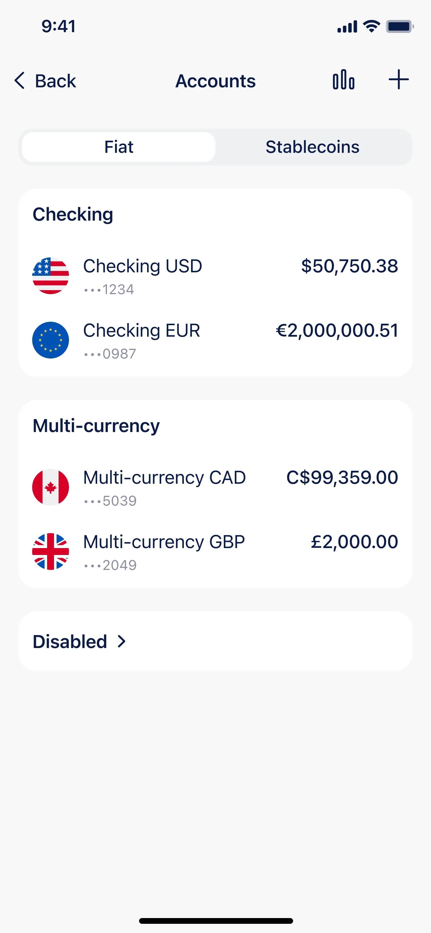
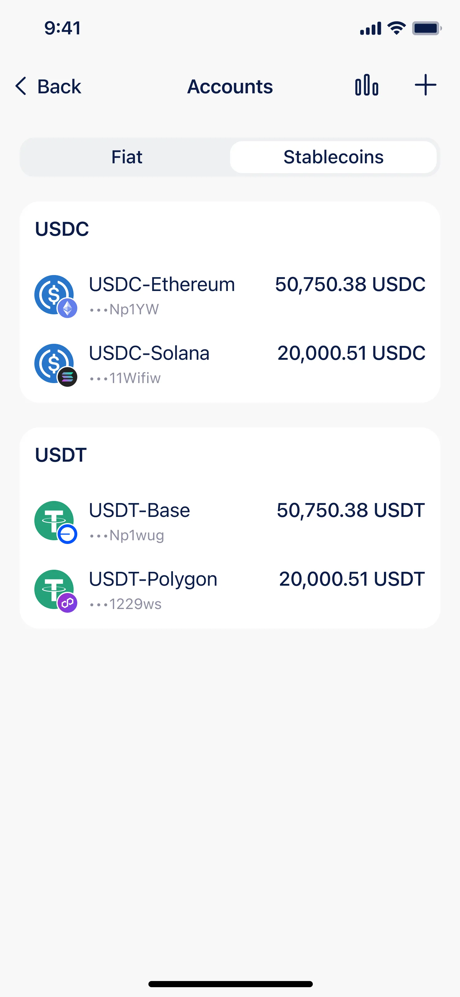
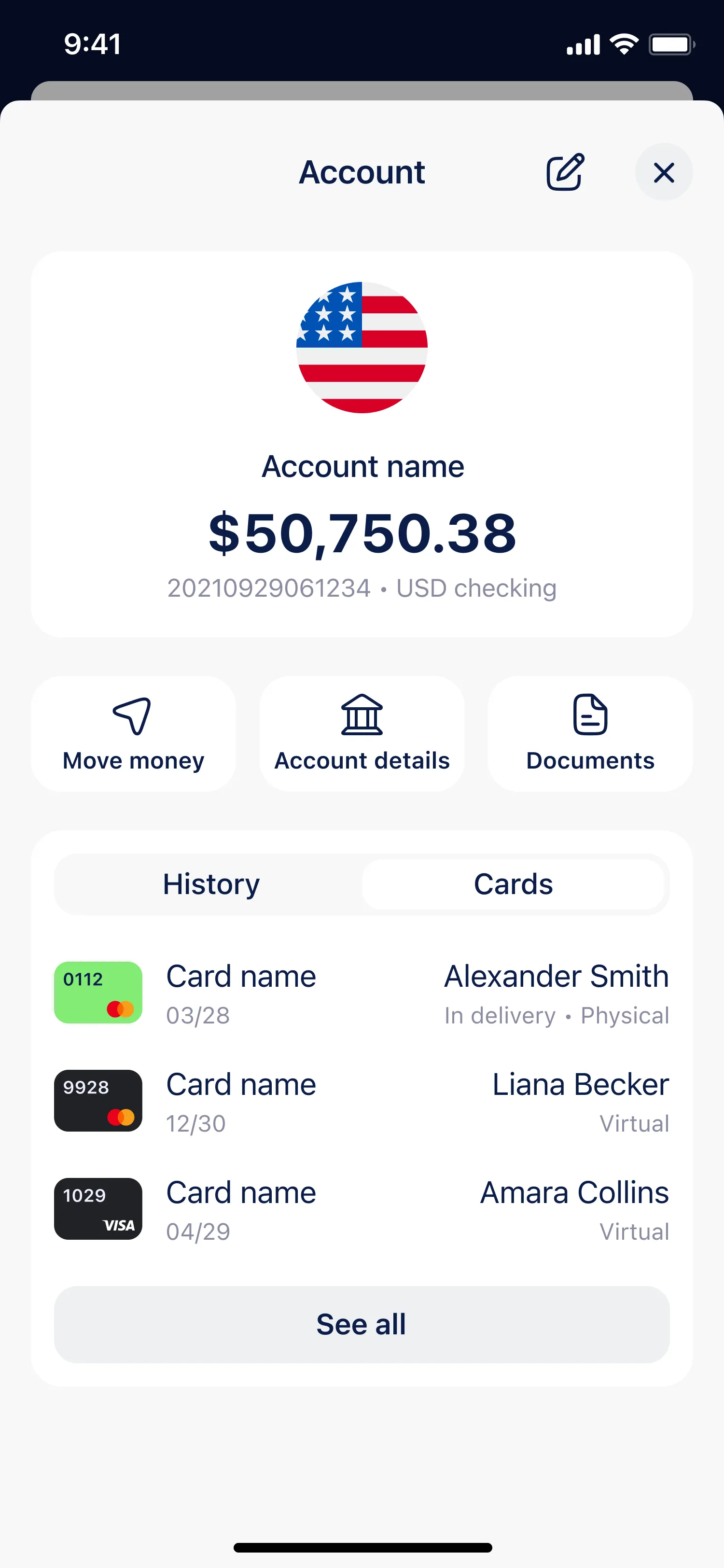
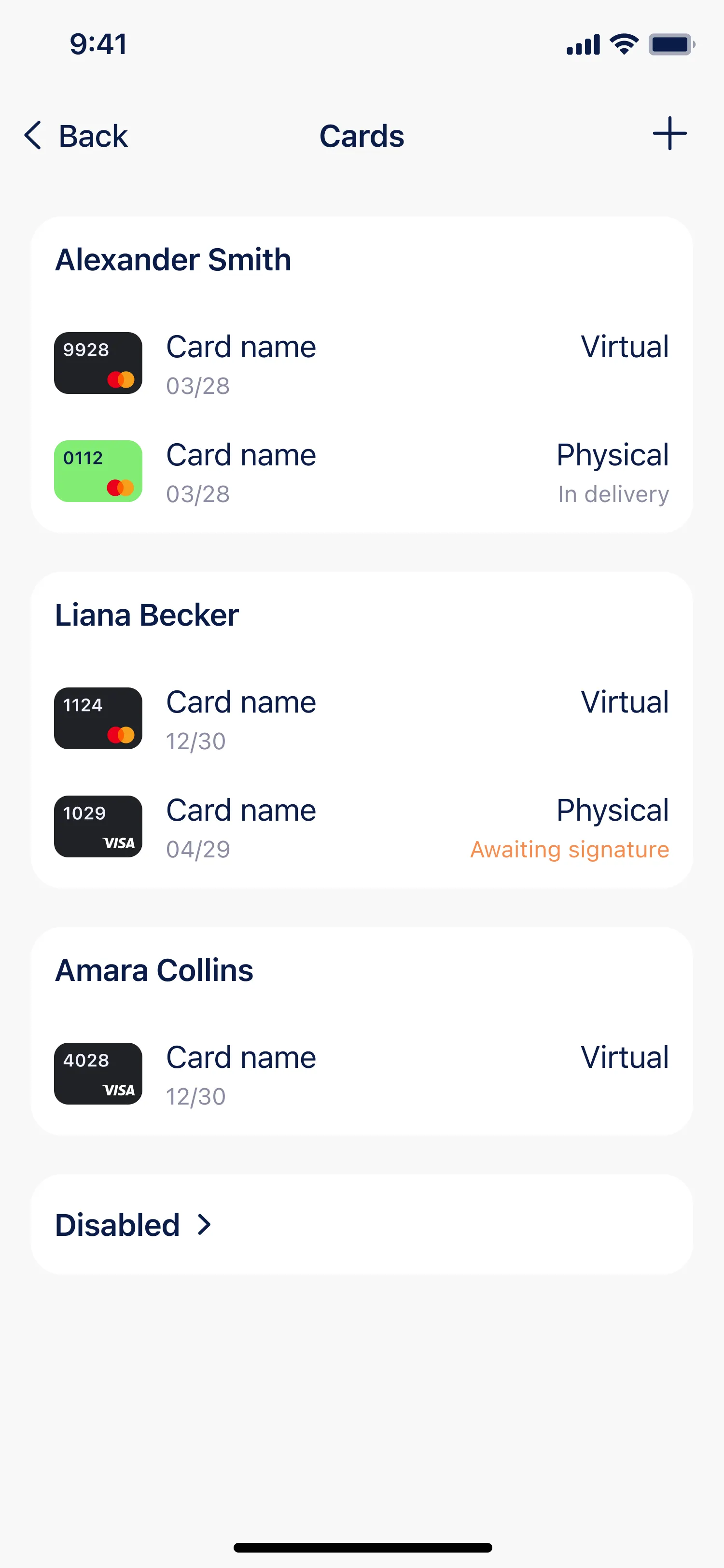
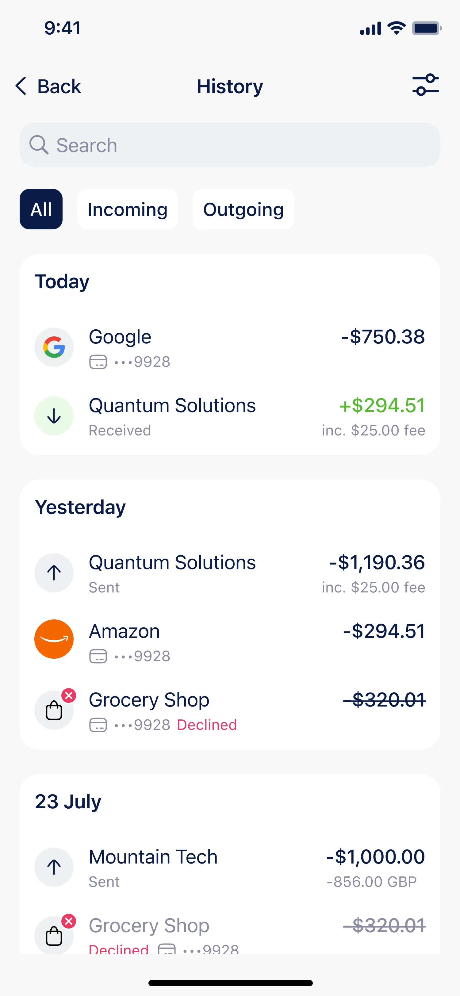
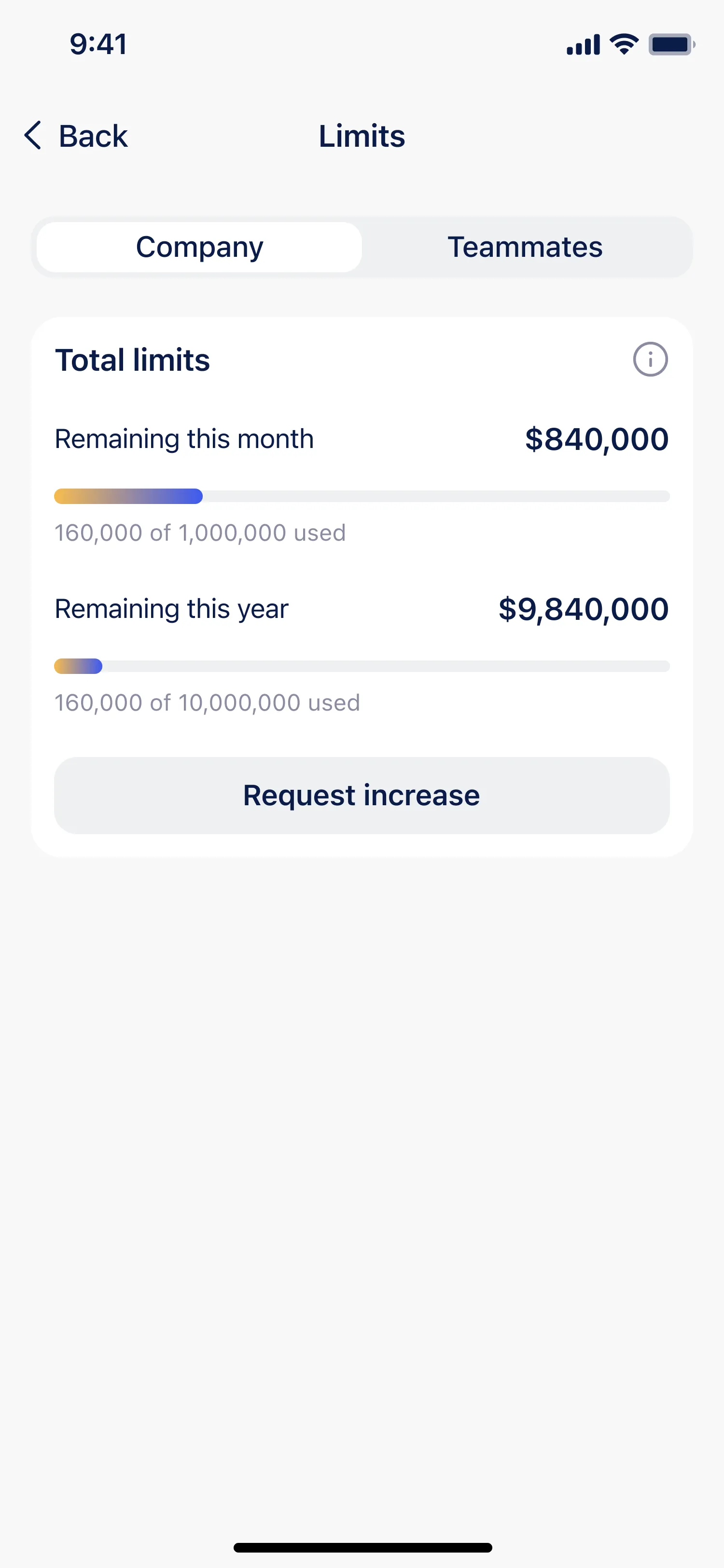
The home screen works as a hub. Accounts, Cards, Company limits, and History each get their own widget with the key number visible right away, and every widget doubles as a shortcut: one tap opens the full section. Balances are split into Fiat and Stablecoins, and the main actions sit directly under the account list. The screens below are the ones a user can reach in a single tap from home.
- 3 Visual hierarchy and interaction
Simplified the typography, evened out the spacing, and kept a clear visual rhythm. Followed iOS interaction patterns while keeping the structure adaptable for Android.
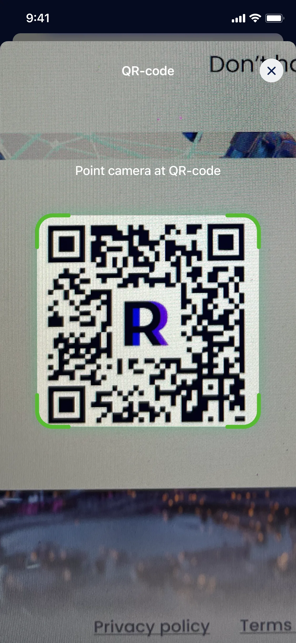
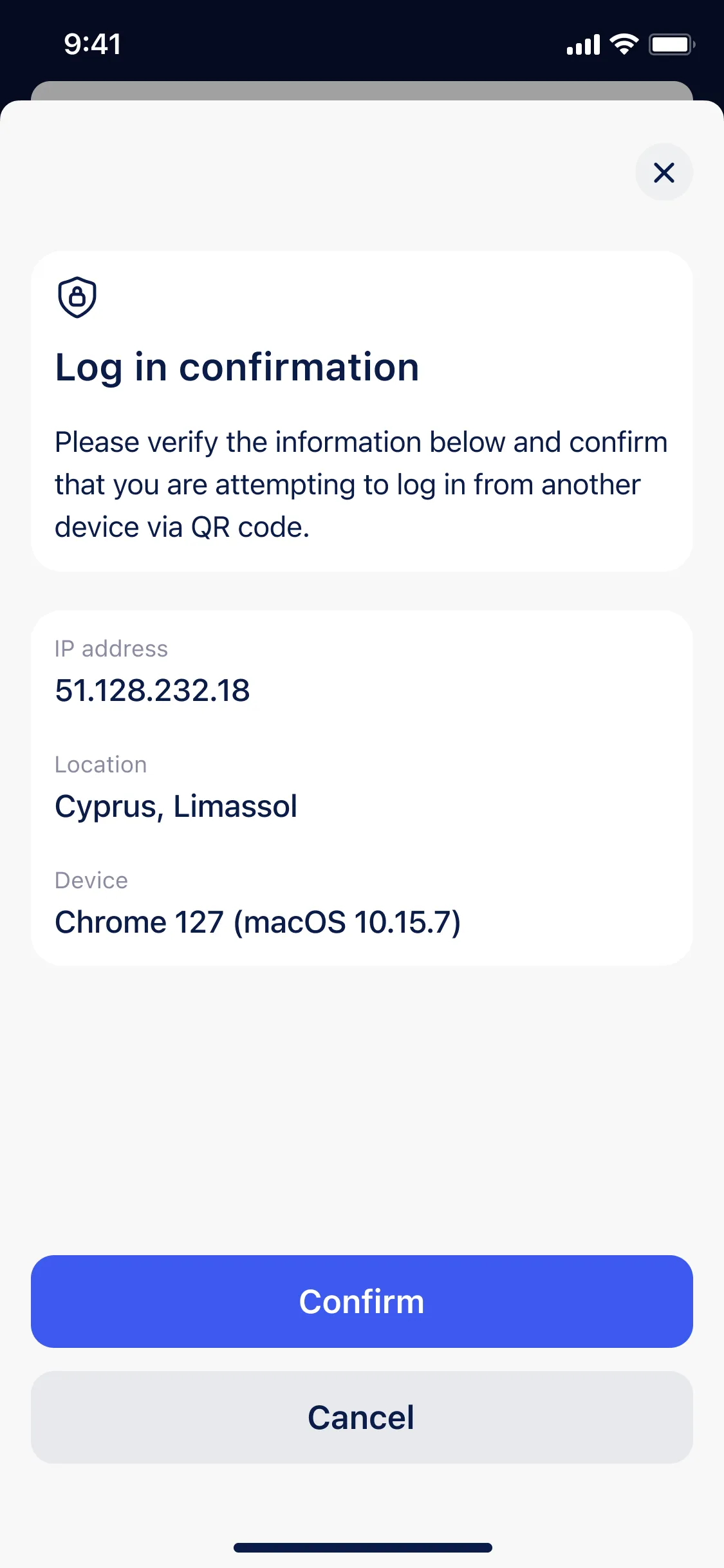
- 4 QR-code scanner
Quick login to the web app by scanning a QR code, with no extra two-factor step.
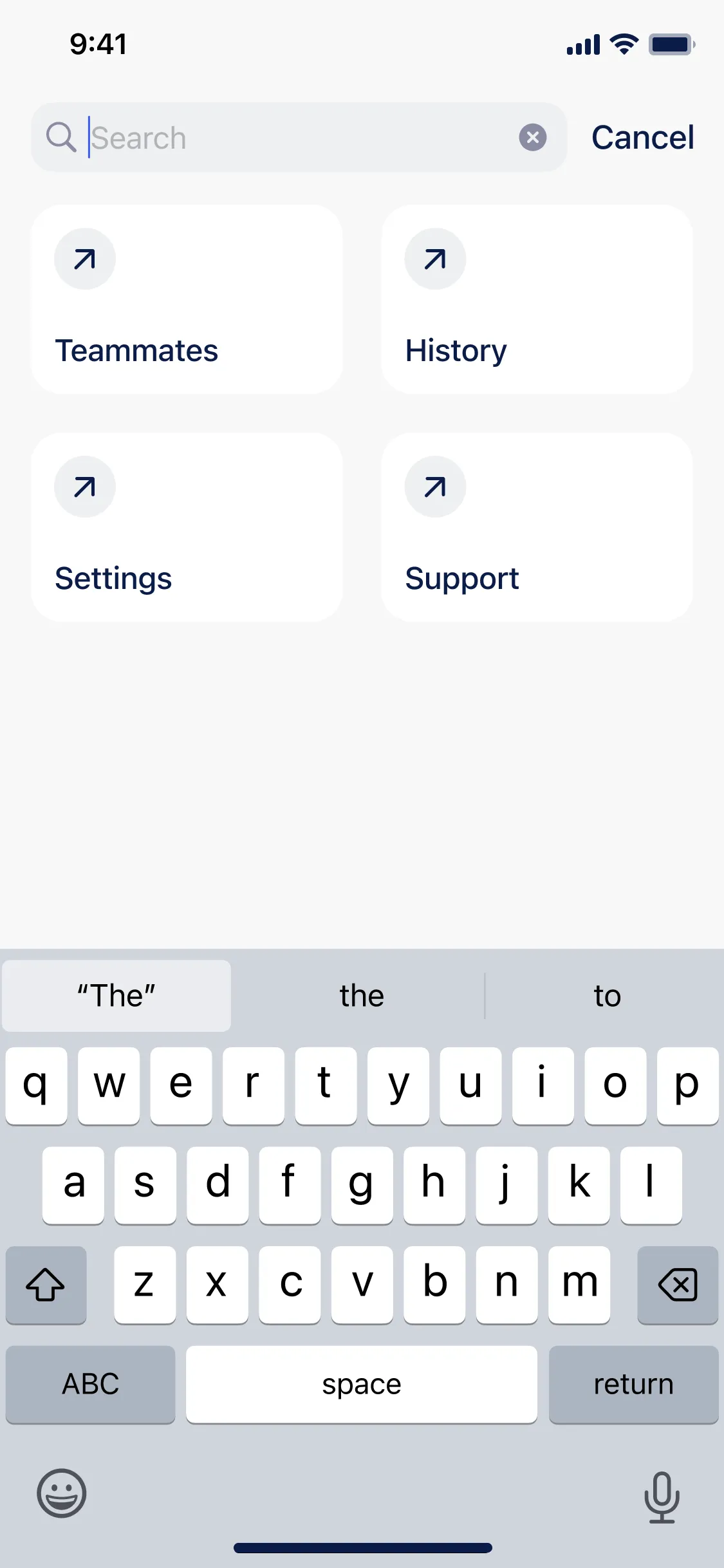
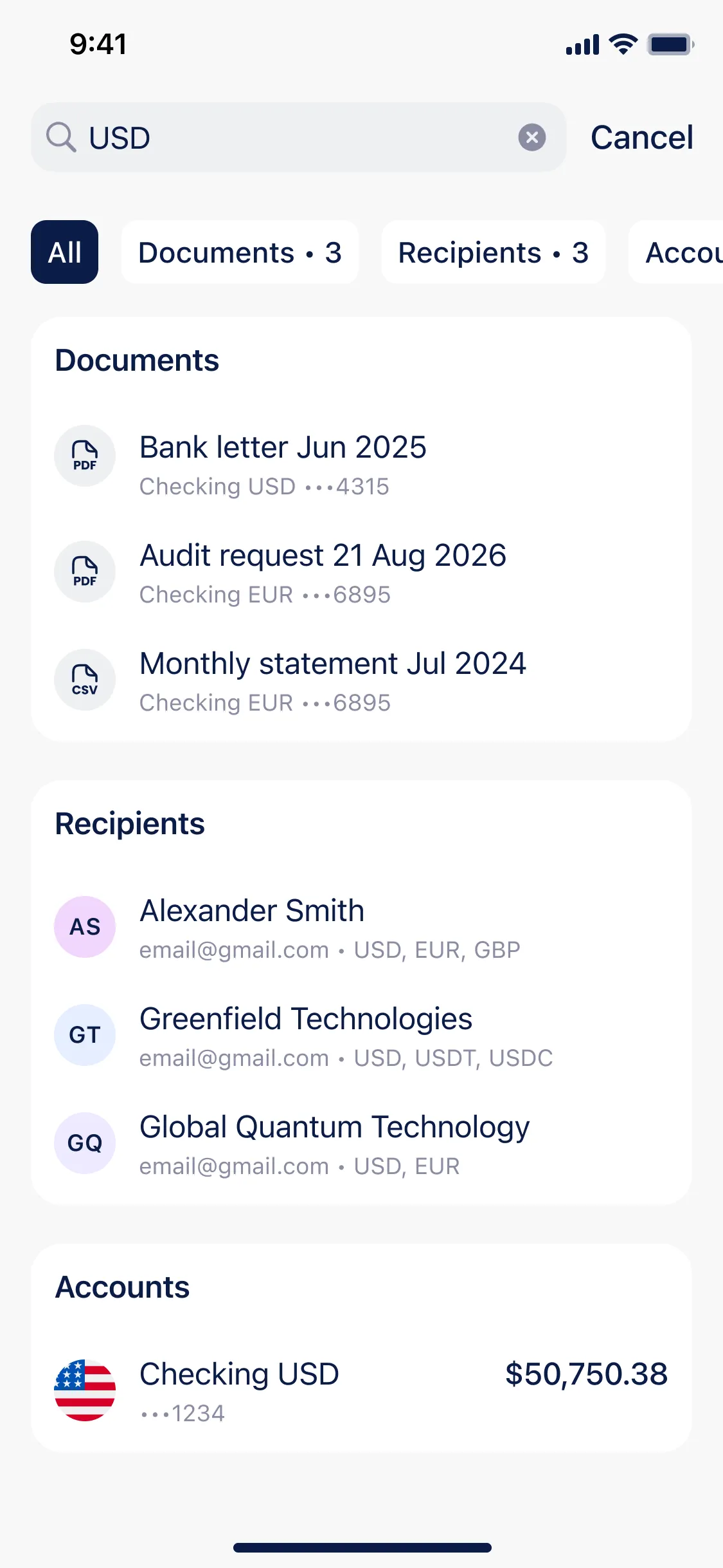
- 5 Global Search
Added a unified search across all sections for faster navigation.
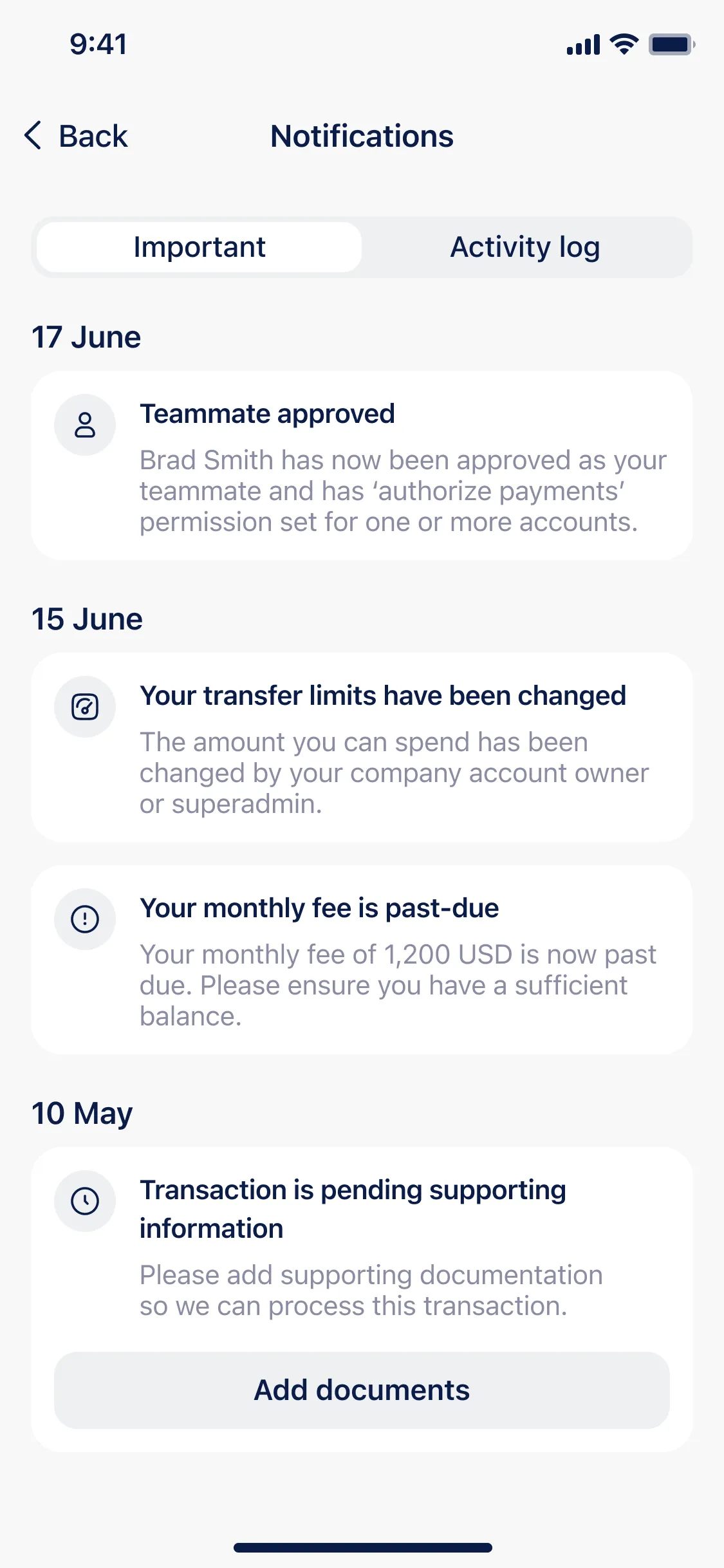
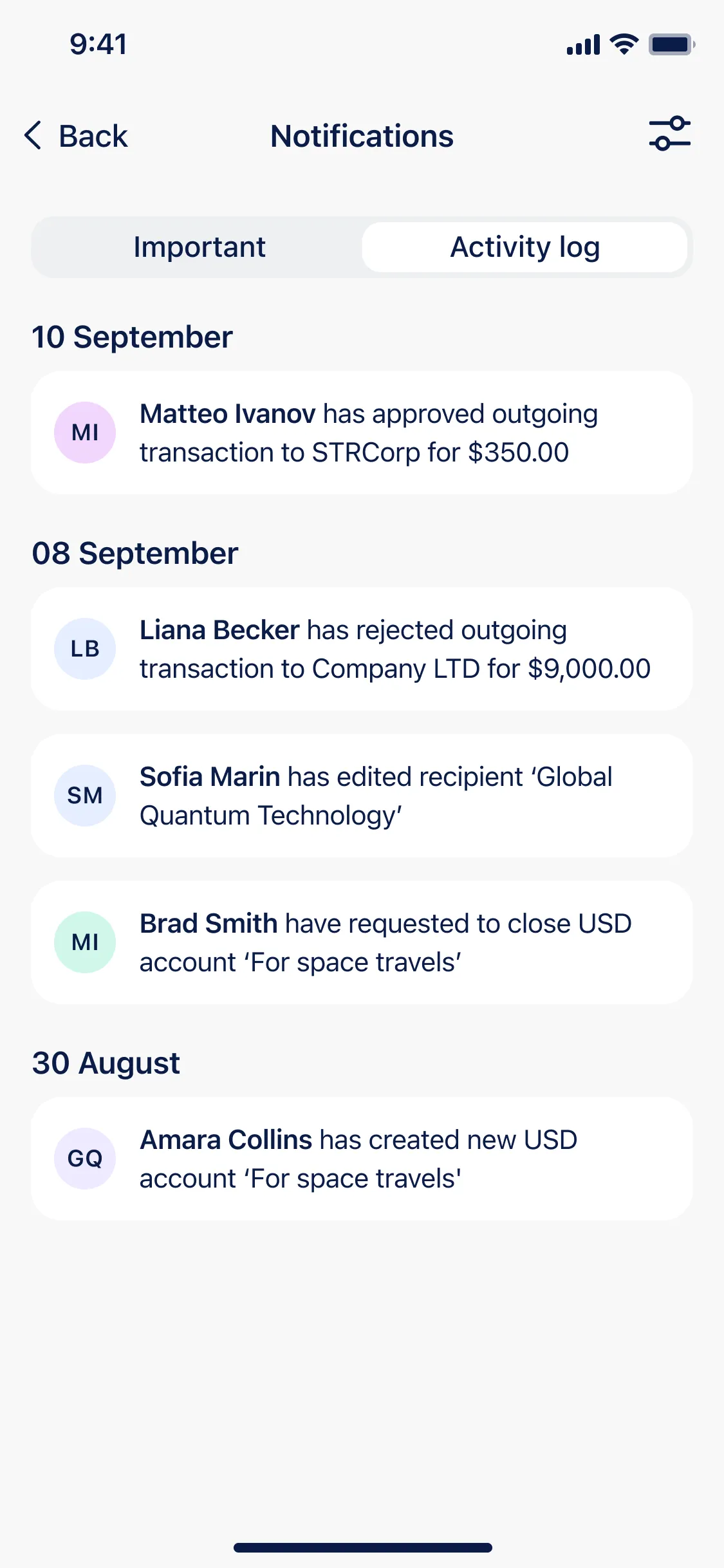
- 6 Notifications and activity log
Implemented a detailed log that allows account owners to track teammate actions such as creating transactions or editing recipients.
Documents module
I designed and built the Documents section from the ground up. It brings user-uploaded files and bank-generated documents into one place. Finding, uploading, and managing a document all happens in the app, within legal and storage requirements.
Goal Previously, documents were scattered across different sections: reports, payment details, and uploaded files were stored separately, which made navigation confusing and slowed down work. The goal was to create a single, well-structured hub where users could access all their files, pin important ones, add notes, archive or delete outdated items, and collaborate more effectively.
Result After launch, all documents lived in one place. Search and navigation got faster, teams kept notes right on the files they discussed, and within a few months more than 20% of active users were using the section regularly.
Personal challenge The main challenge was to design a structure that felt immediately clear while still complying with legal restrictions and file storage policies. It also had to balance two distinct flows (user-uploaded documents and bank-generated ones), making sure both worked within the same logic. Every type of generated document required its own optimized flow, which demanded careful planning of both architecture and interaction details.
Workflow
- 1 Research and analysis
Studied how people search, upload, view, and share documents on mobile, pulling from feedback, support requests, behavioral data, and the technical limits around file storage.
- 2 Direction
Set the tasks: one unified hub, simpler navigation, and full compliance and security, tuned to both iOS and Android. Defined the document categories (personal, banking, legal) and the navigation logic, then checked the early thinking with quick prototypes and usability sessions.
- 3 Design and prototyping
Built layouts and interactive prototypes around mobile use: tabs, search, pinned files, upload, plus the generate, archive, and share scenarios. Tested on devices for speed and clarity, refined the details, and adapted patterns to iOS HIG and Material Design for a consistent feel on both platforms.
- 4 Handover
Delivered detailed Figma specs, component libraries, and exportable assets, then supported development through implementation and later iterations as new document types shipped.
Design solutions
- 1 Unified entry point
A dedicated Documents tab in the main navigation: every file is reachable from one place.
- 2 Clear categorization
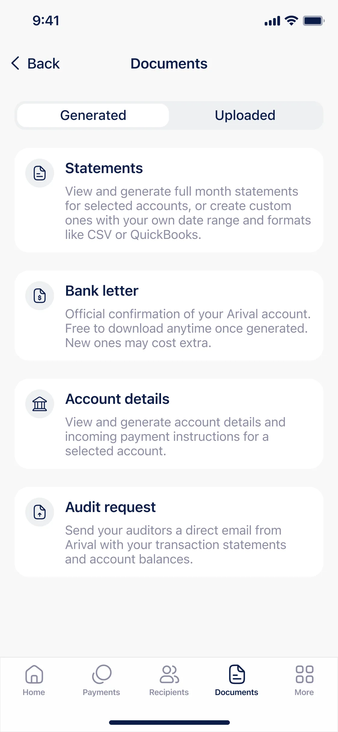
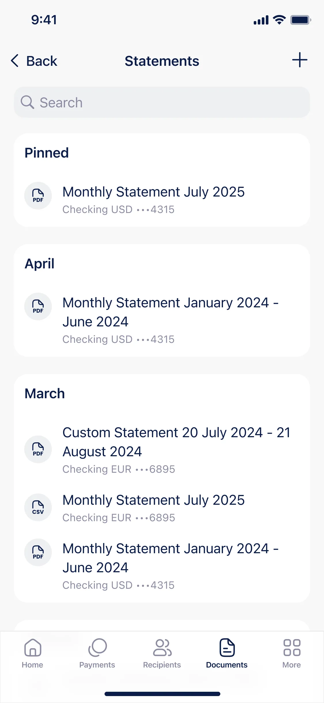
I grouped files into five categories: Statements, Bank letters, Account details, Legal, and Uploaded. Predictable, and easy to scan.
- 3 Card-based layout
- 4 Document generation flow
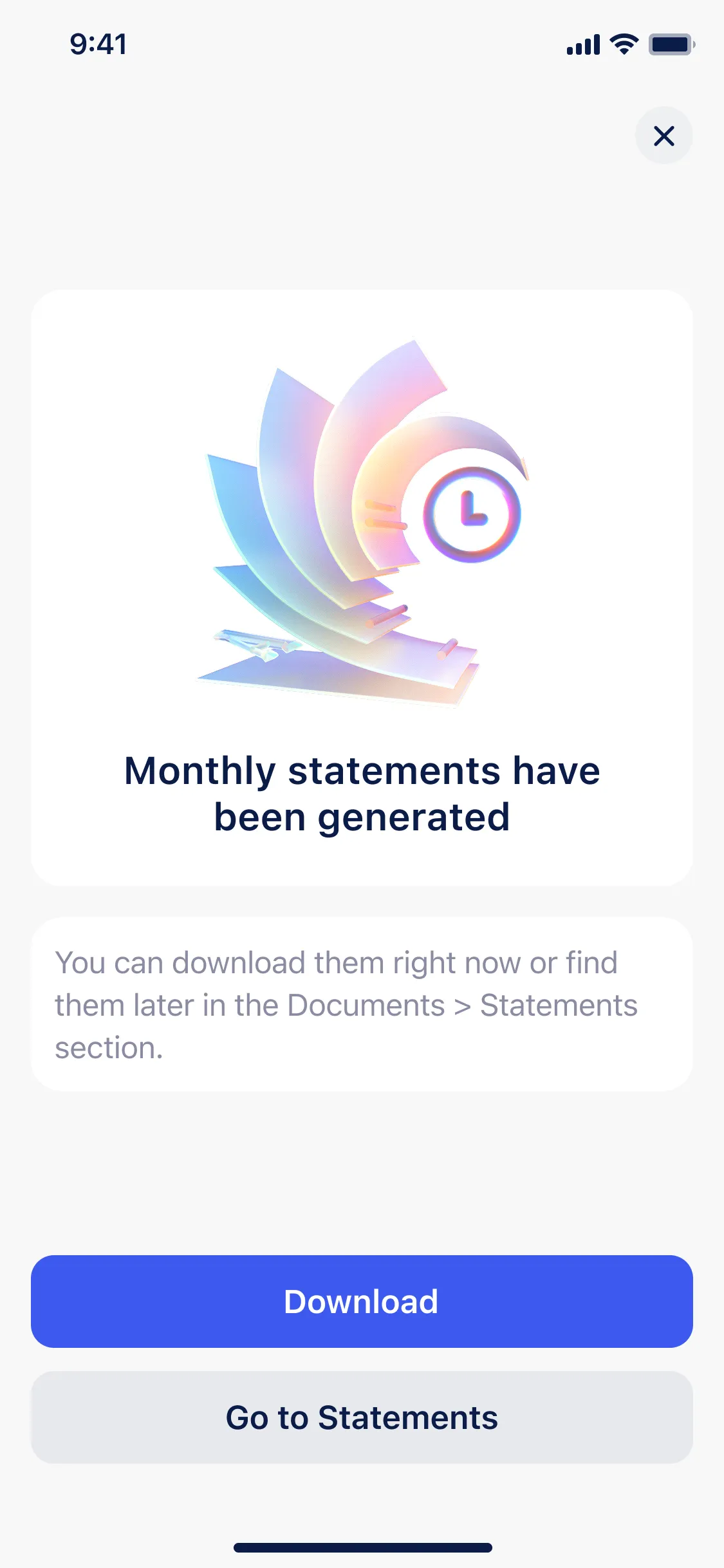
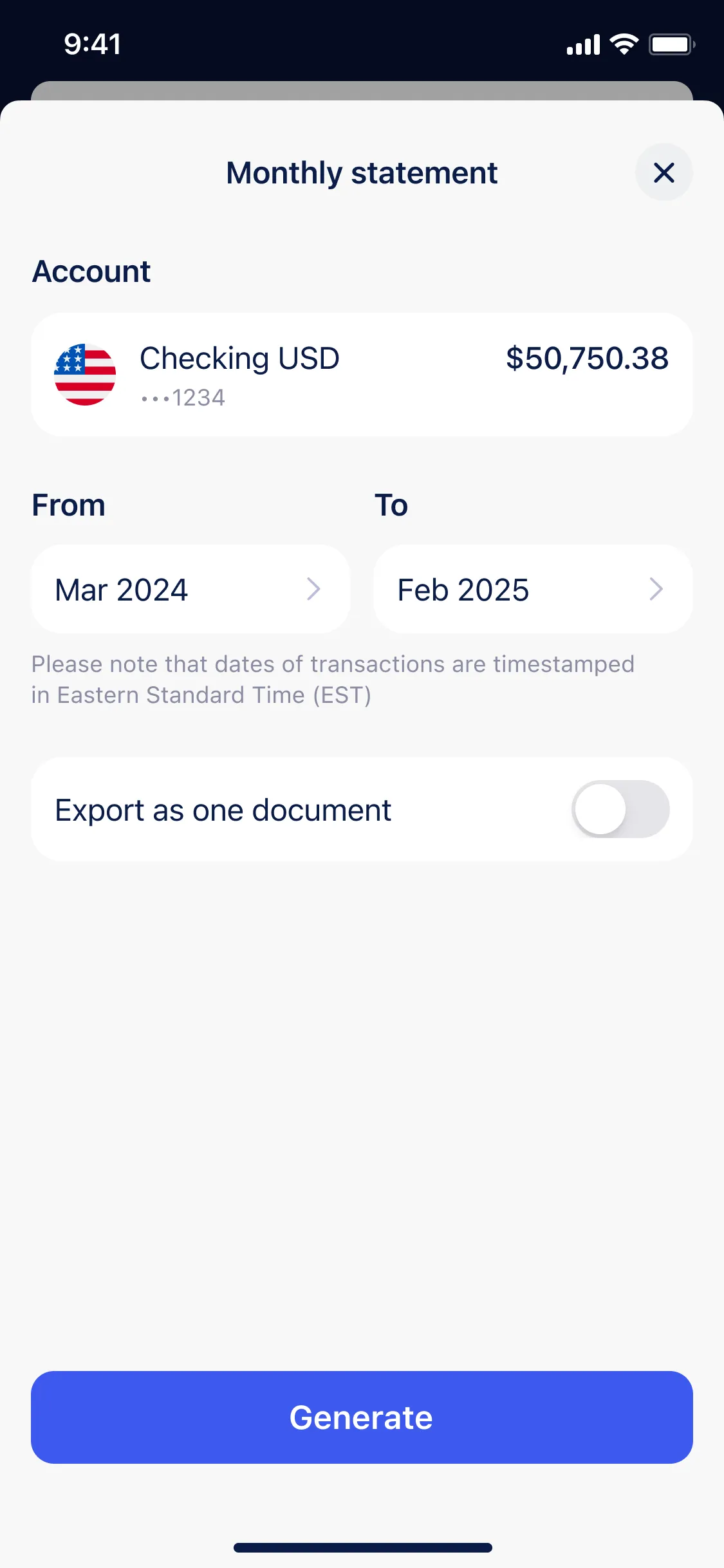
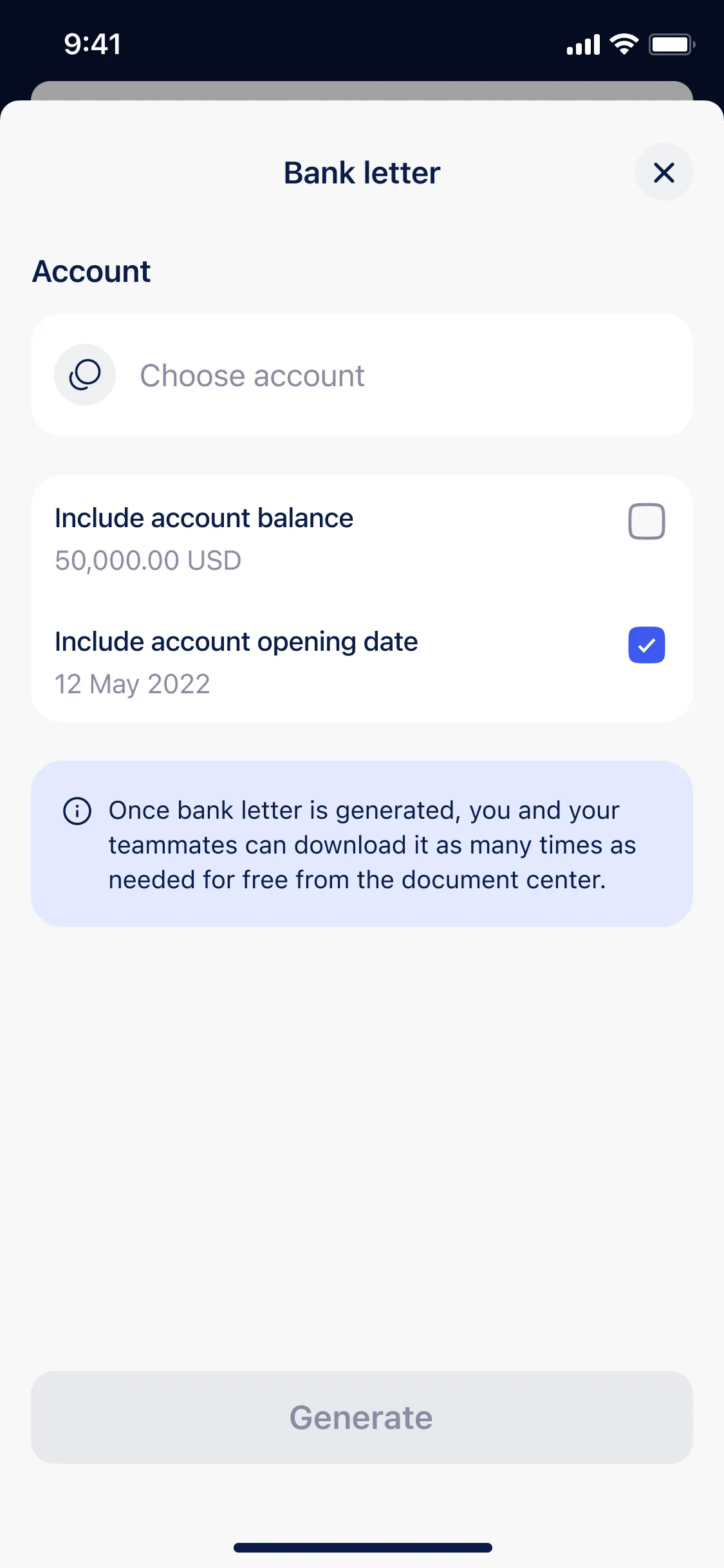
Introduced a dedicated flow for generating bank documents. Users could set parameters like statement period or letter type, and the system automatically created and saved the file in the right section. This reduced support requests and gave users full control over document generation and reuse.
- 5 Upload new document
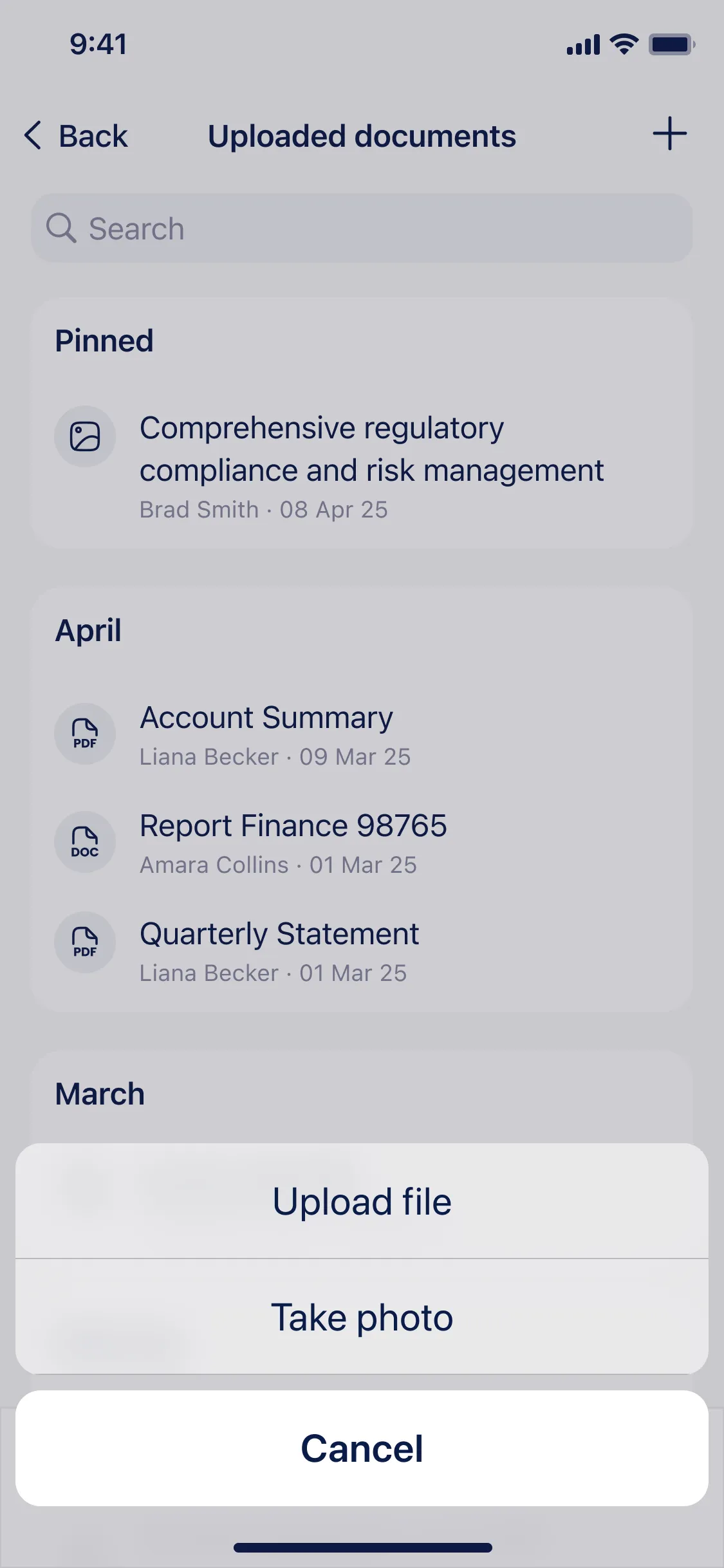
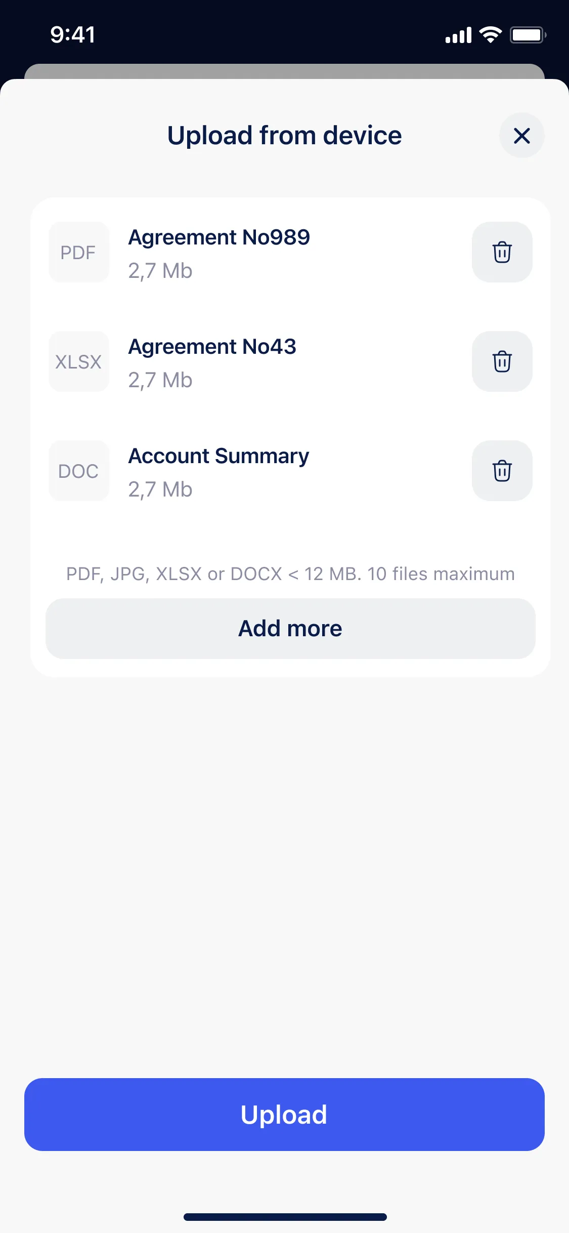
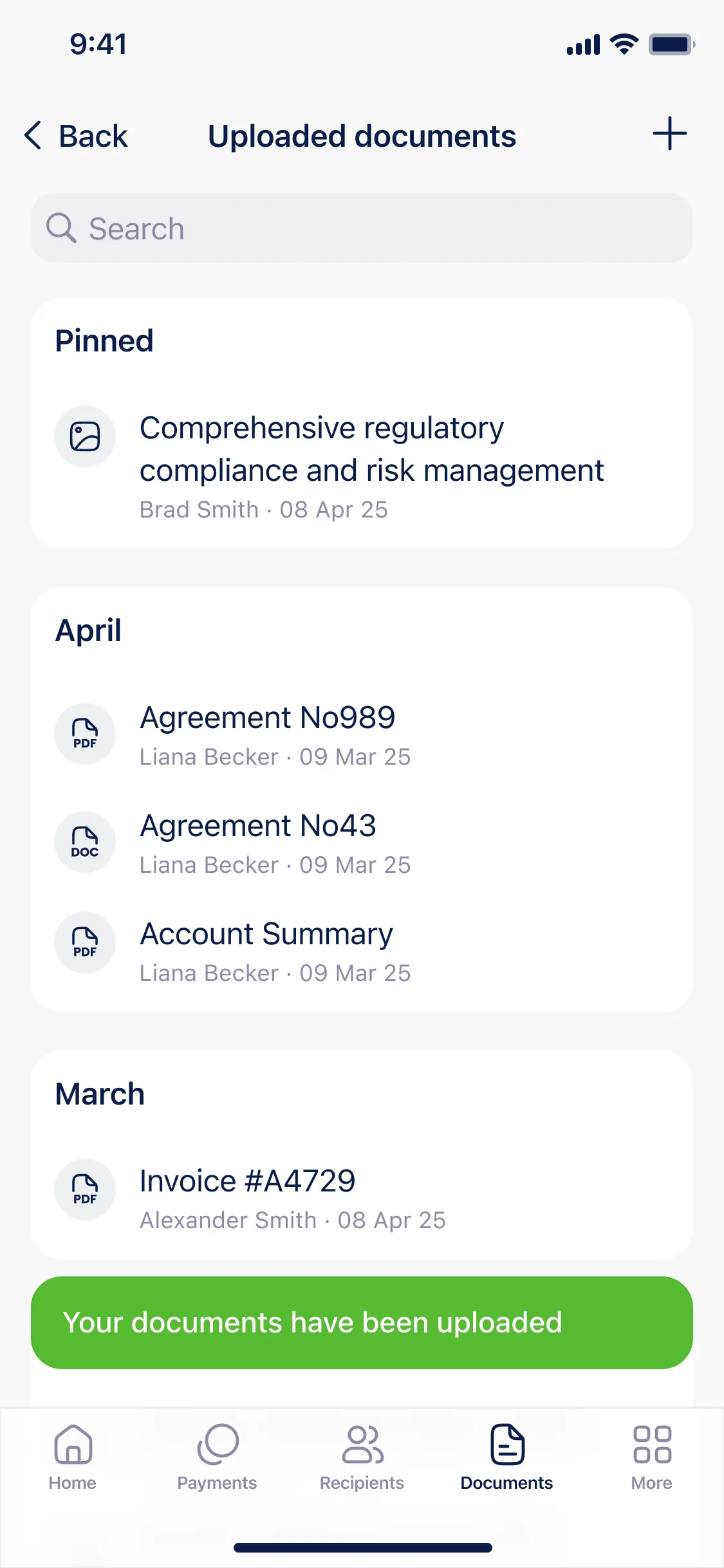
Users can now upload their own documents directly in the app.
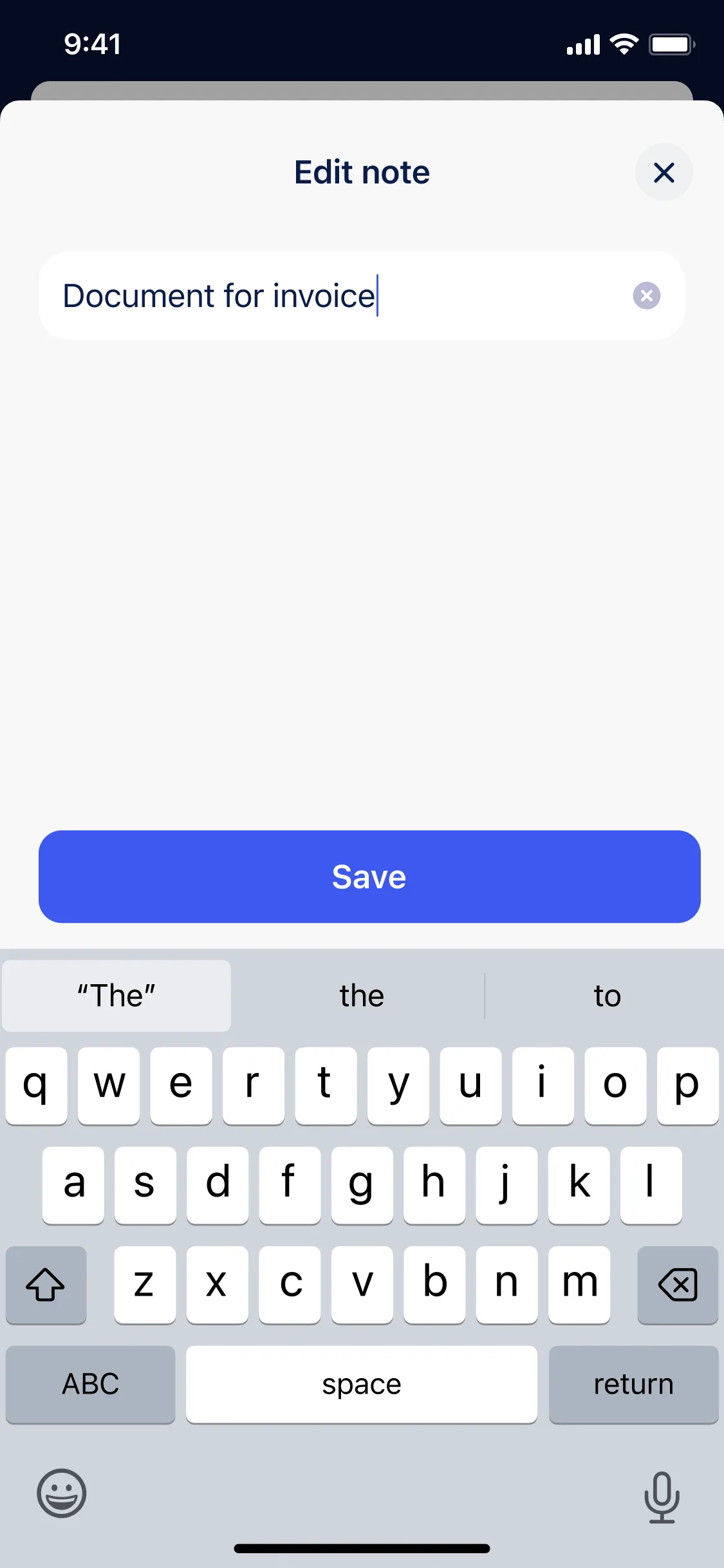
- 6 Notes feature
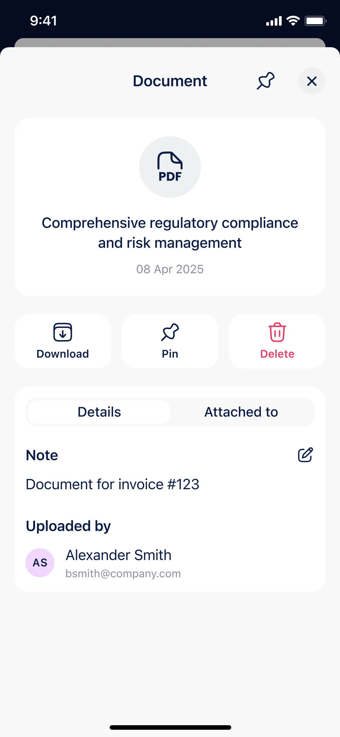
Notes sit inside the document card and are visible to the whole team, so the discussion stays attached to the file itself.
- 7 Details card
Each document type gets its own screen with the actions and details that actually apply to it.
- 8 Consistency across platforms
Everything follows iOS and Android guidelines, so the section feels native on both platforms.