Arival Bank (Web)
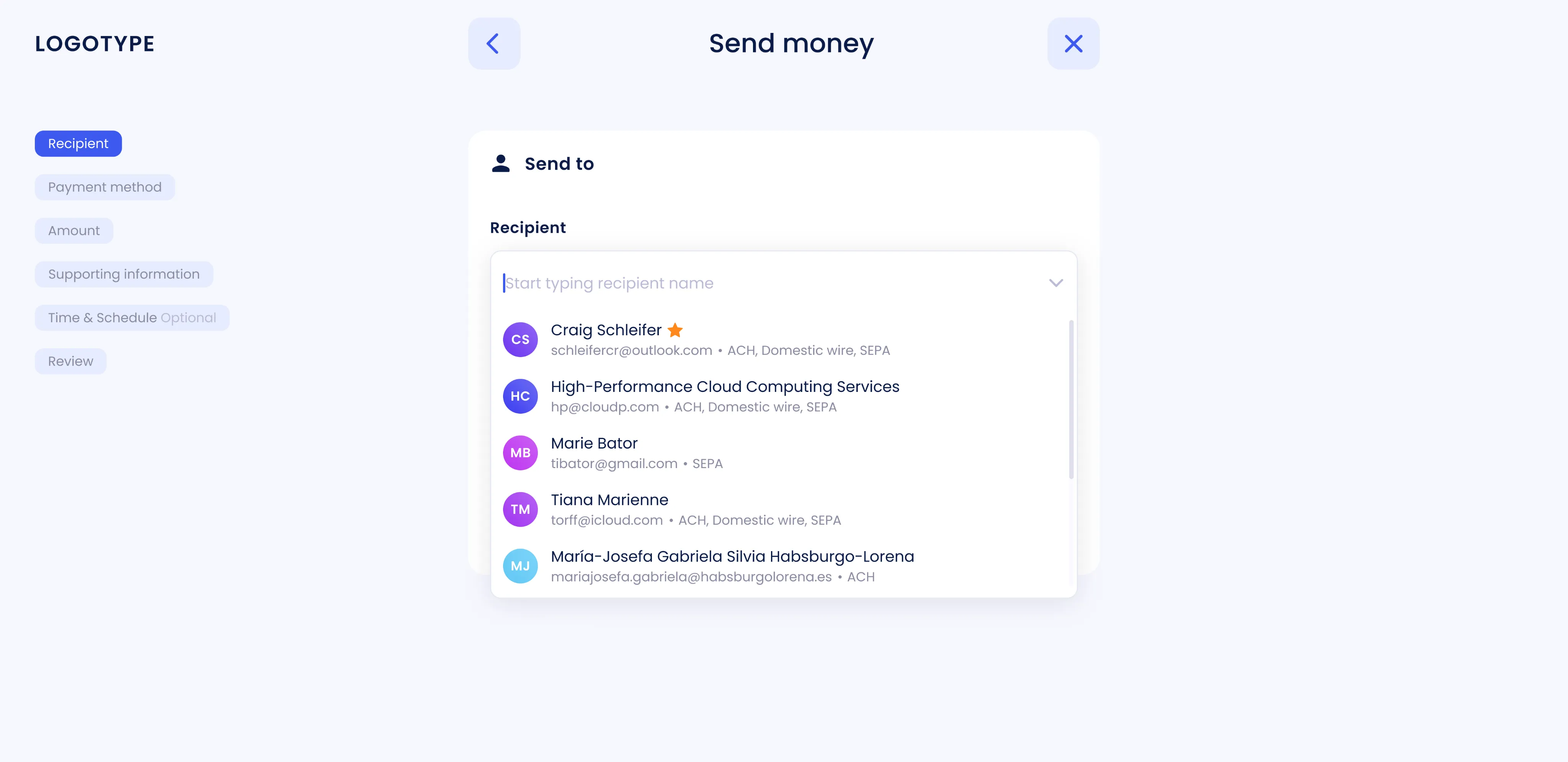
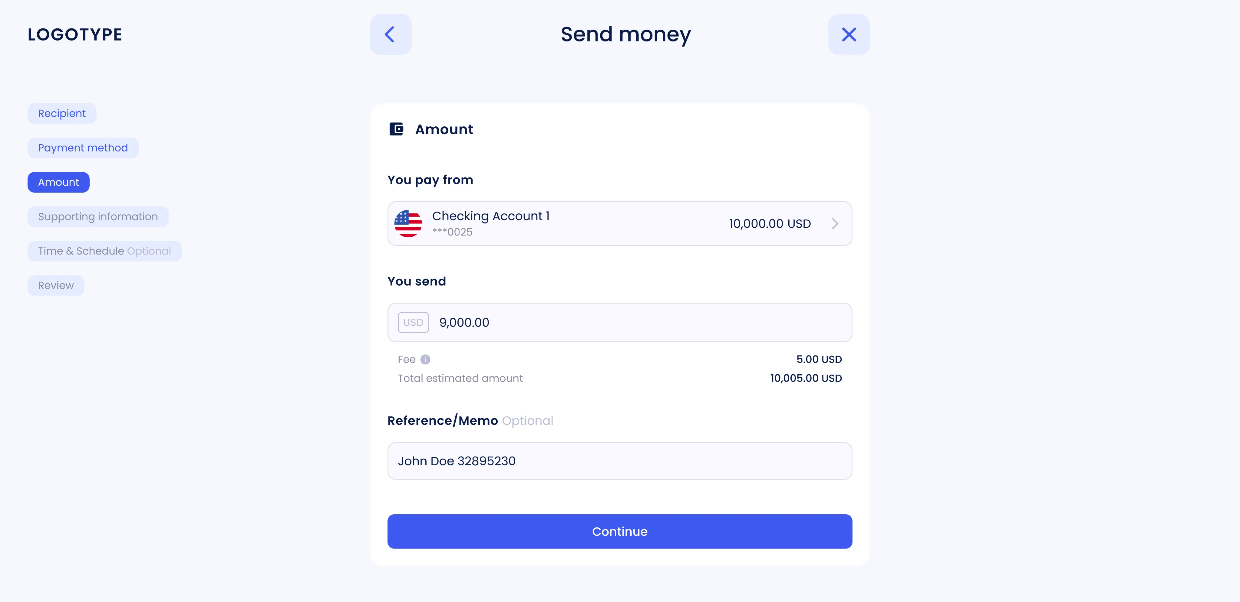
Send money flow
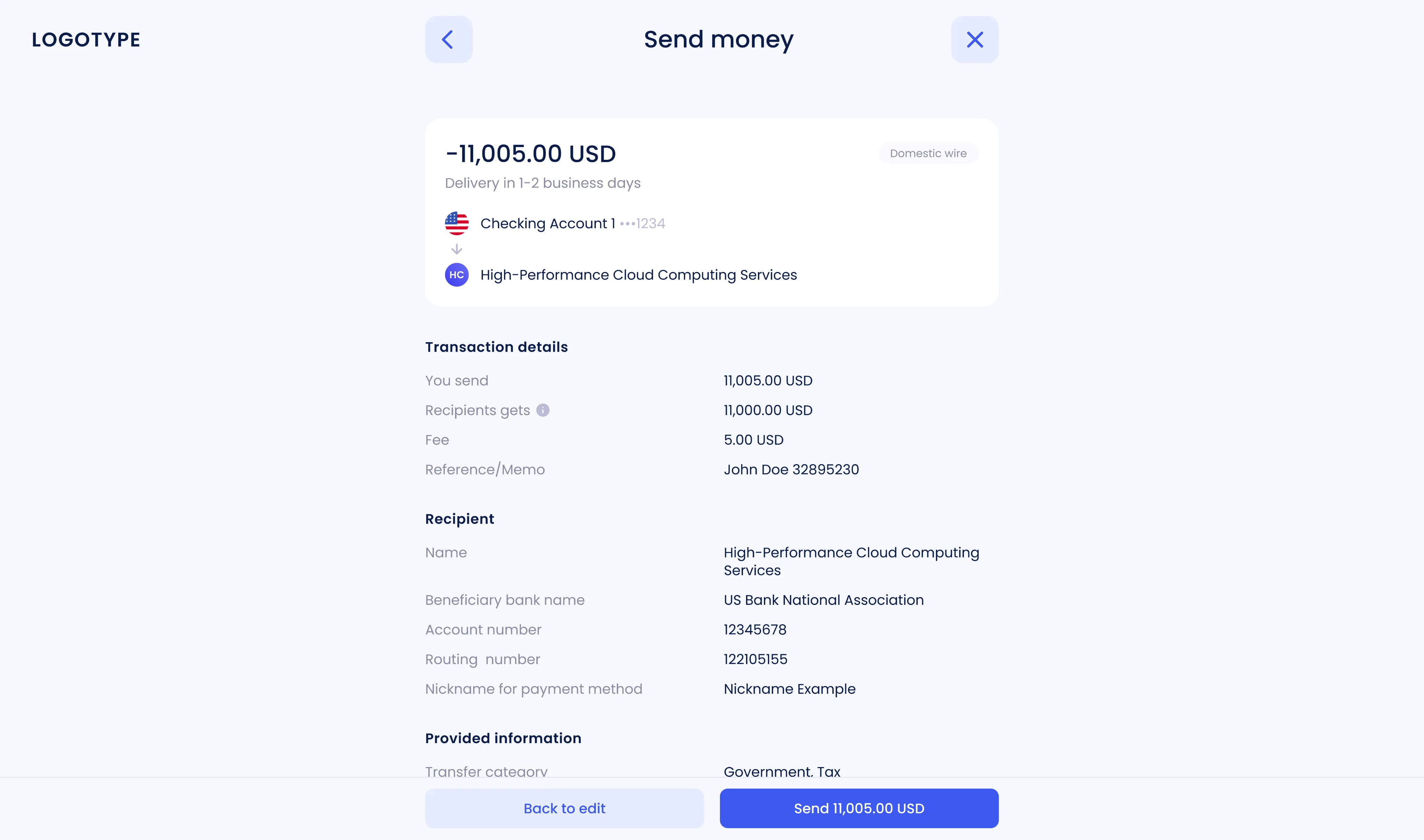
The payment process was redesigned from the ground up to make it faster and easier to understand. The flow was simplified, the information architecture restructured, and the review stage made more intuitive to help users make confident decisions. Flexible options for recurring payments were added, along with a new timeline that clearly shows transaction details and status at every stage.
 Goal
Goal Over time, the one-time payment flow had become overloaded. Users faced repeated steps, a cluttered review screen, and limited control over recurring transactions. Transparency was also an issue, it was hard to tell where a payment stood or what came next. The goal was to streamline the flow, reduce time to completion, make statuses clearer, and introduce flexible recurring payment settings.
 Result
 The new flow became shorter, cleaner, and more predictable. Users completed payments faster and with fewer mistakes, while confusion during the review stage almost disappeared. This had a direct impact on support, the number of transfer-related questions dropped noticeably. Although specific numbers are under NDA, the overall completion time decreased, success rates improved, and support requests went down.
 Personal challenge
 The challenge was to turn a fragmented set of B2B requirements. Roles, access rules, approvals, limits into one simple, logical flow that works for both everyday users and complex business cases. Balancing clarity, flexibility, and compliance was key.
Workflow
- 1 Analysis of the current payment flow
Feedback from users, stakeholders, and support helped identify bottlenecks and redundant steps. Analytics showed confusion during review and setup, and limited control over recurring transactions.
- 2 Defining goals and constraints
The redesign focused on simplifying the one-time payment flow, improving clarity in the review stage, and introducing flexible recurring payment settings, all while staying compliant with business rules.
- 3 Design and prototyping
The structure was rebuilt to group related fields and shorten decision paths. Interactive prototypes covered full end-to-end scenarios for both single and recurring payments.
- 4 Validation and iterations
Designs were tested internally and with users. Feedback led to multiple refinements that improved flow logic, readability, and overall usability. All updates were aligned with the design system for consistency.
- 5 Handover to development
Figma specs and detailed states were prepared for developers. Implementation was supported through design reviews and QA to ensure the final experience matched the intended design.
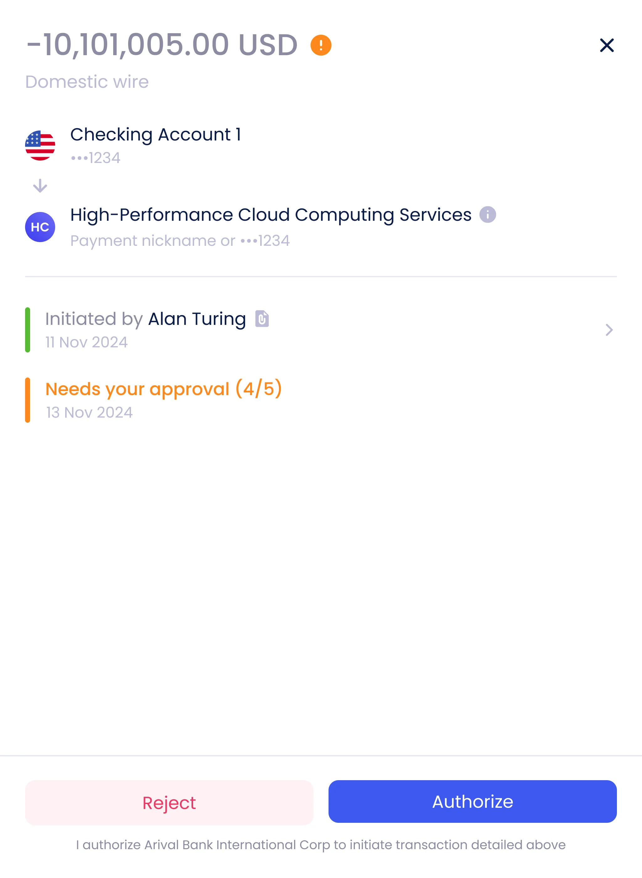
Design solutions
- 1 Consistent review and success screens
A unified system of review and success screens was created for all money-related flows, including Receive Money, Invoices, and Internal Transfers. This consistency reduced maintenance costs and created a predictable experience across the product.
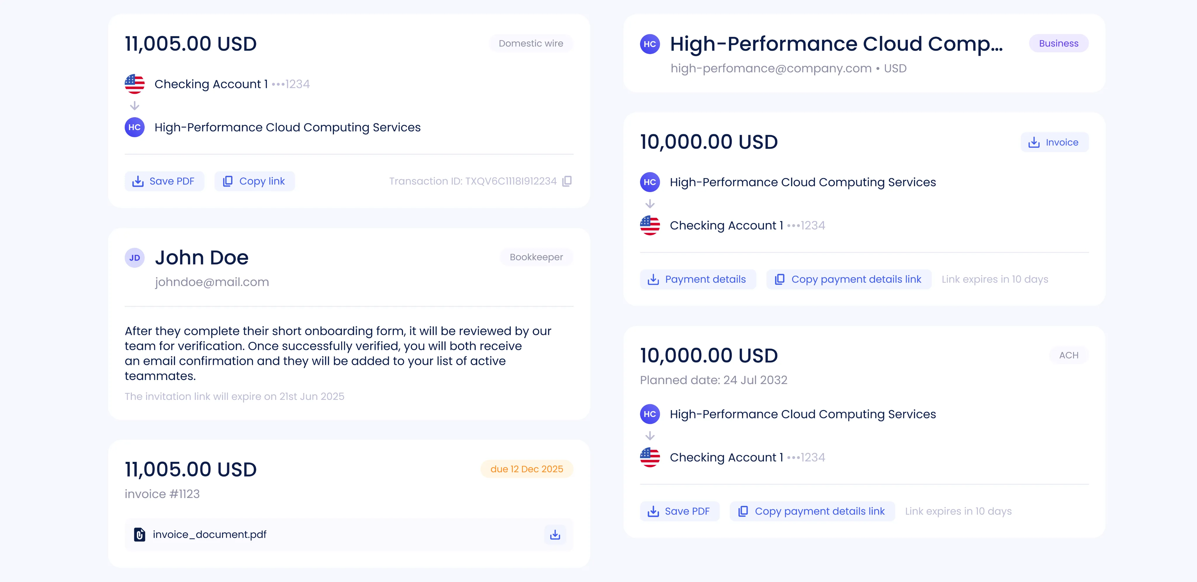
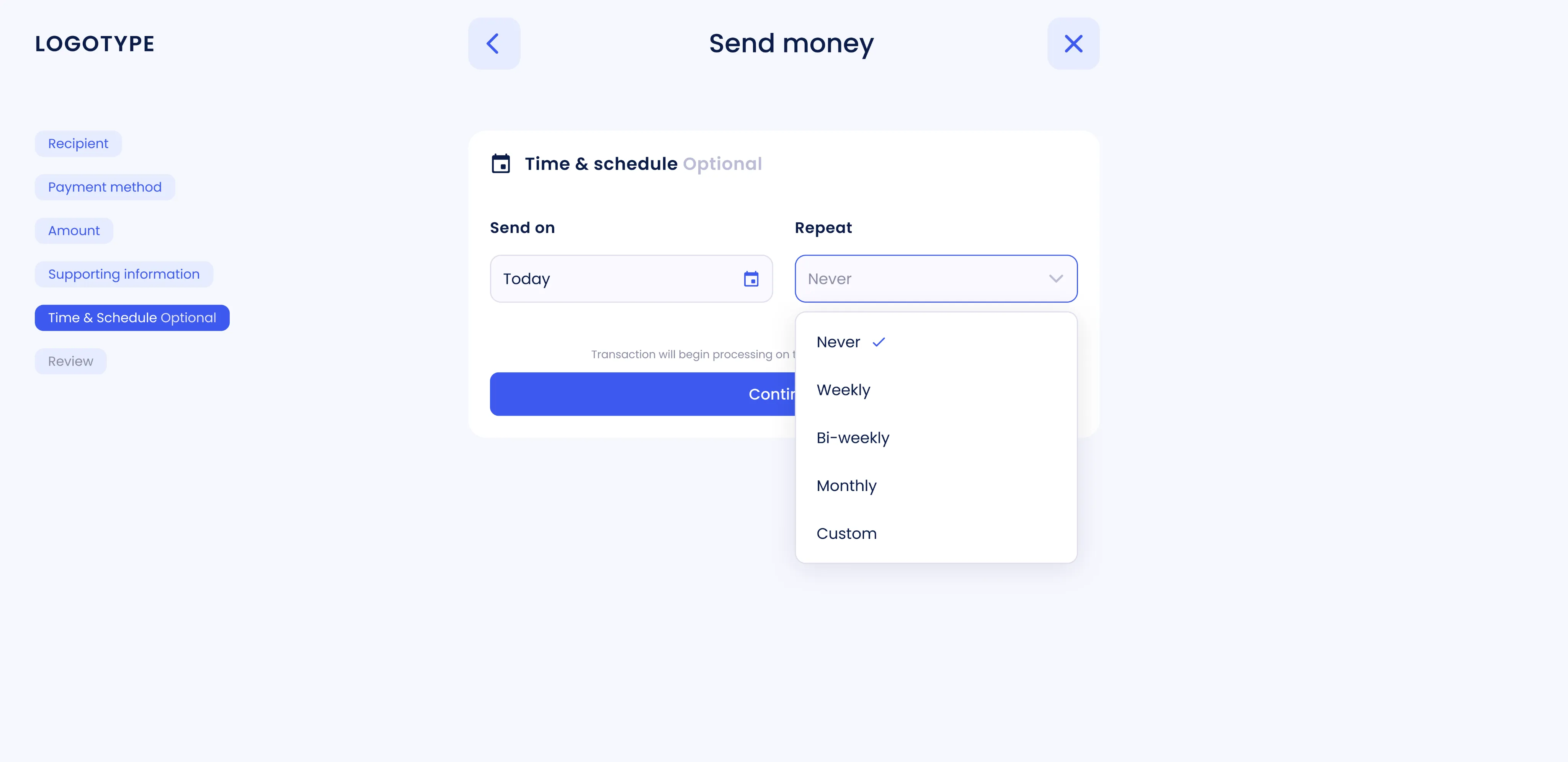
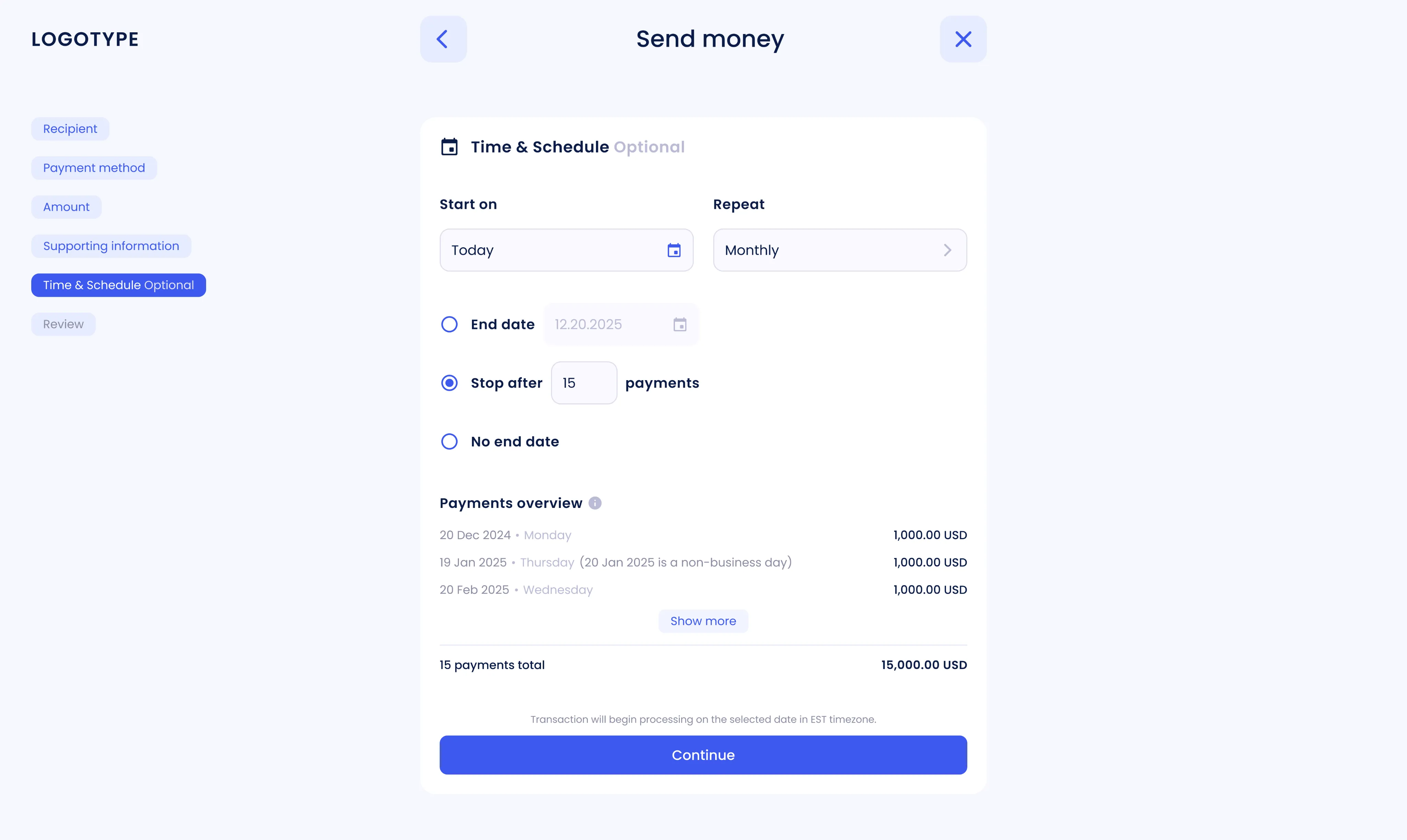
- 2 Recurring payments
Recurring payments were redesigned with flexible settings. Users can now control frequency, total number of transactions, and amounts. Clearer visual feedback helps prevent errors and builds confidence.
- 3 Payment overview
A new overview screen shows all recurring payments, including frequency, dates, and total amounts. It gives users full visibility and makes it easy to manage ongoing transactions.
- 4 Sidebar navigation
A sidebar menu was introduced to display all steps of the process. It helps users stay oriented, reduces cognitive load, and makes multi-step flows easier to follow.
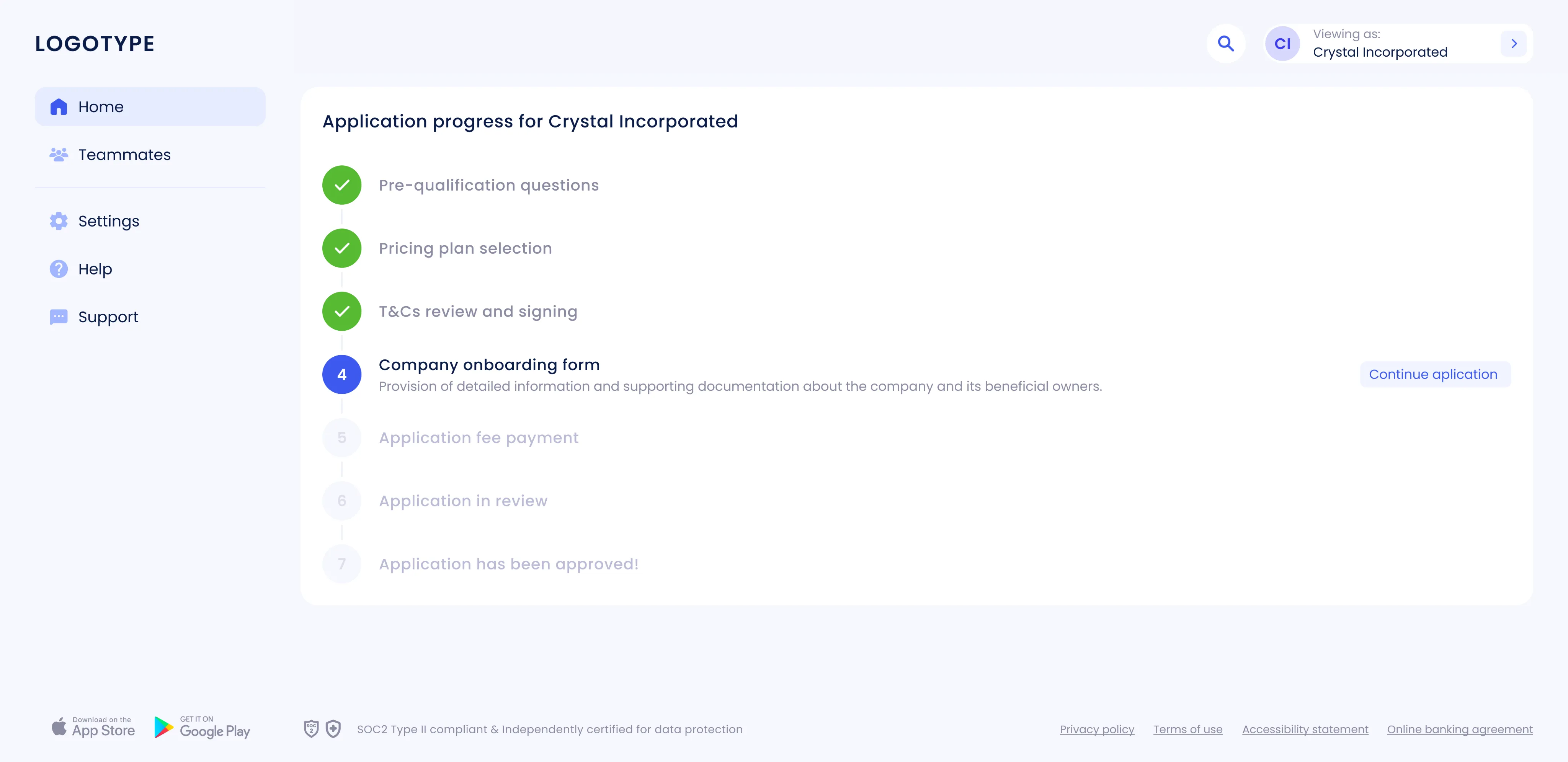
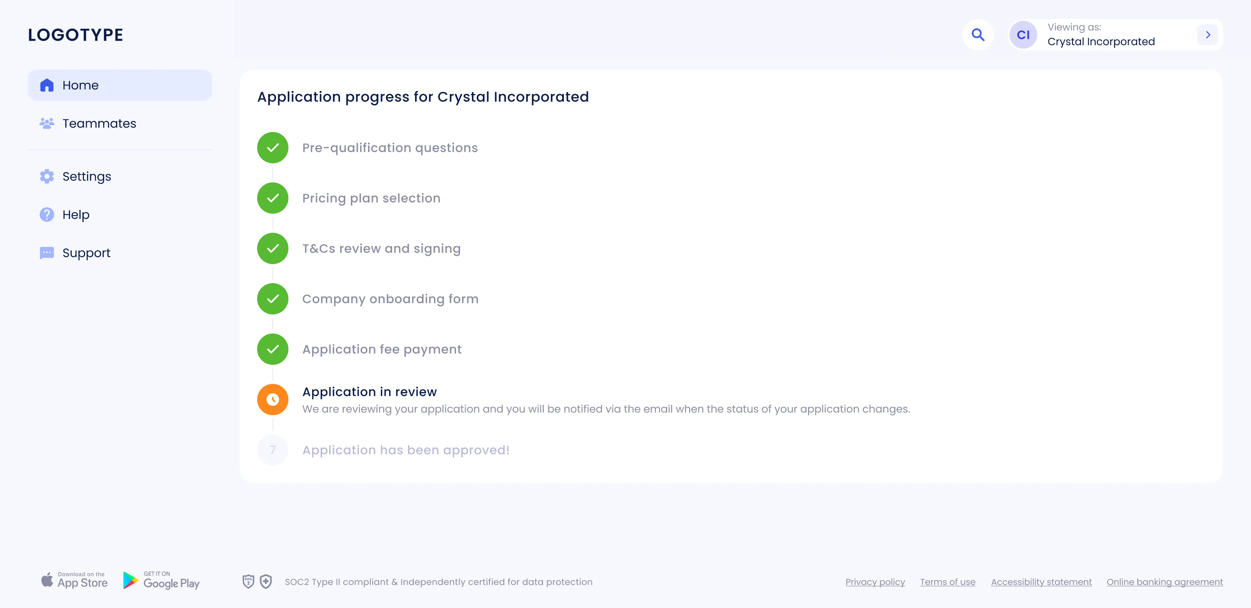
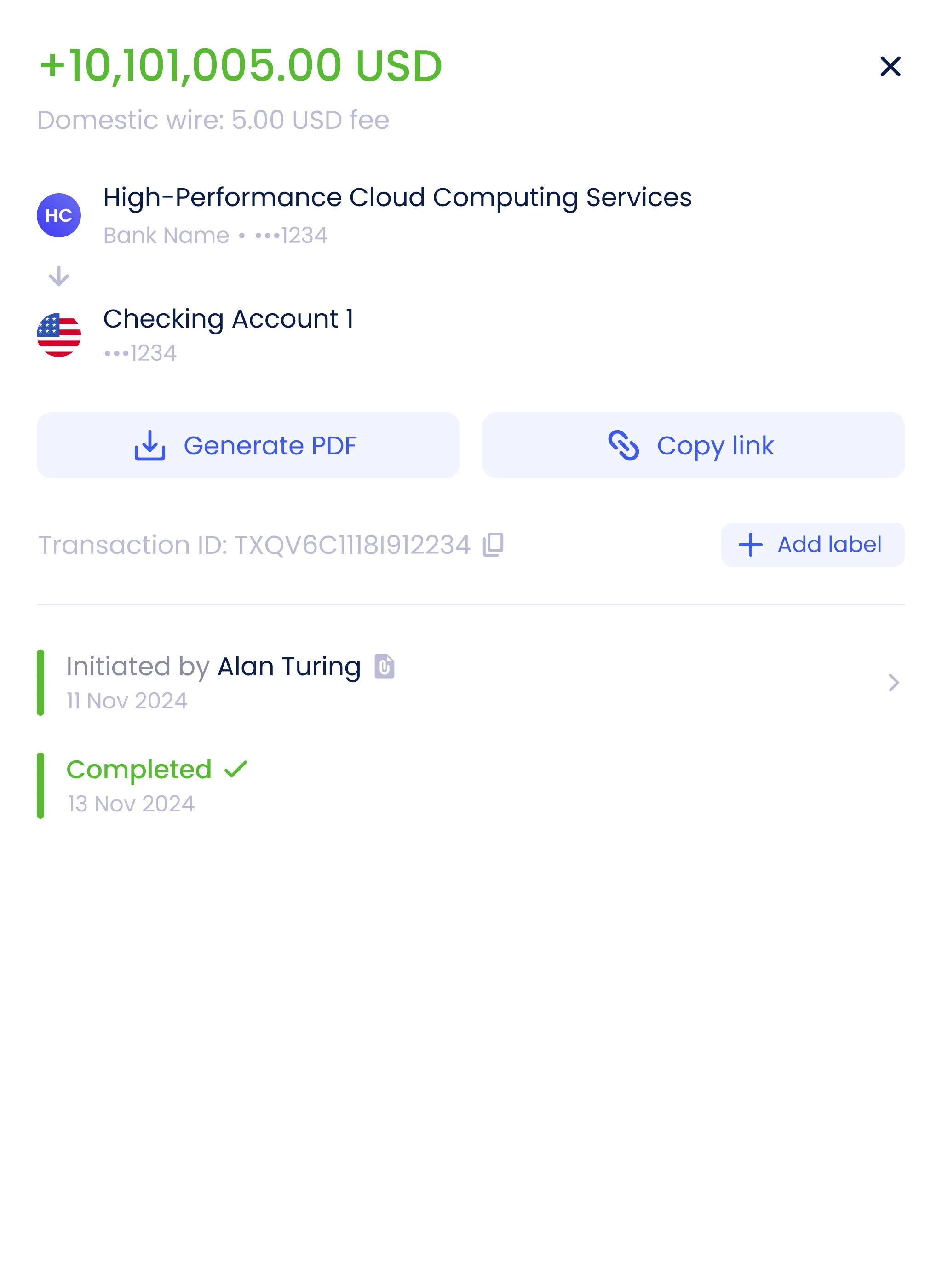
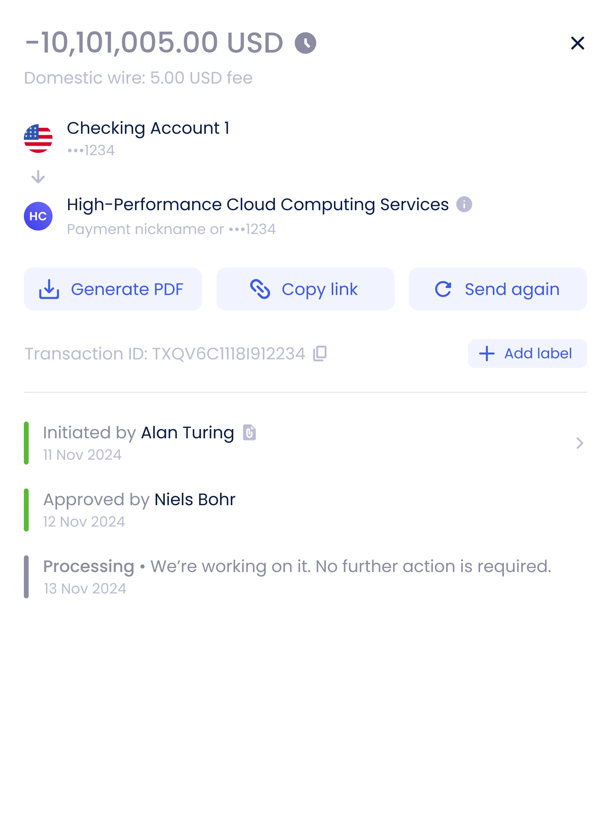
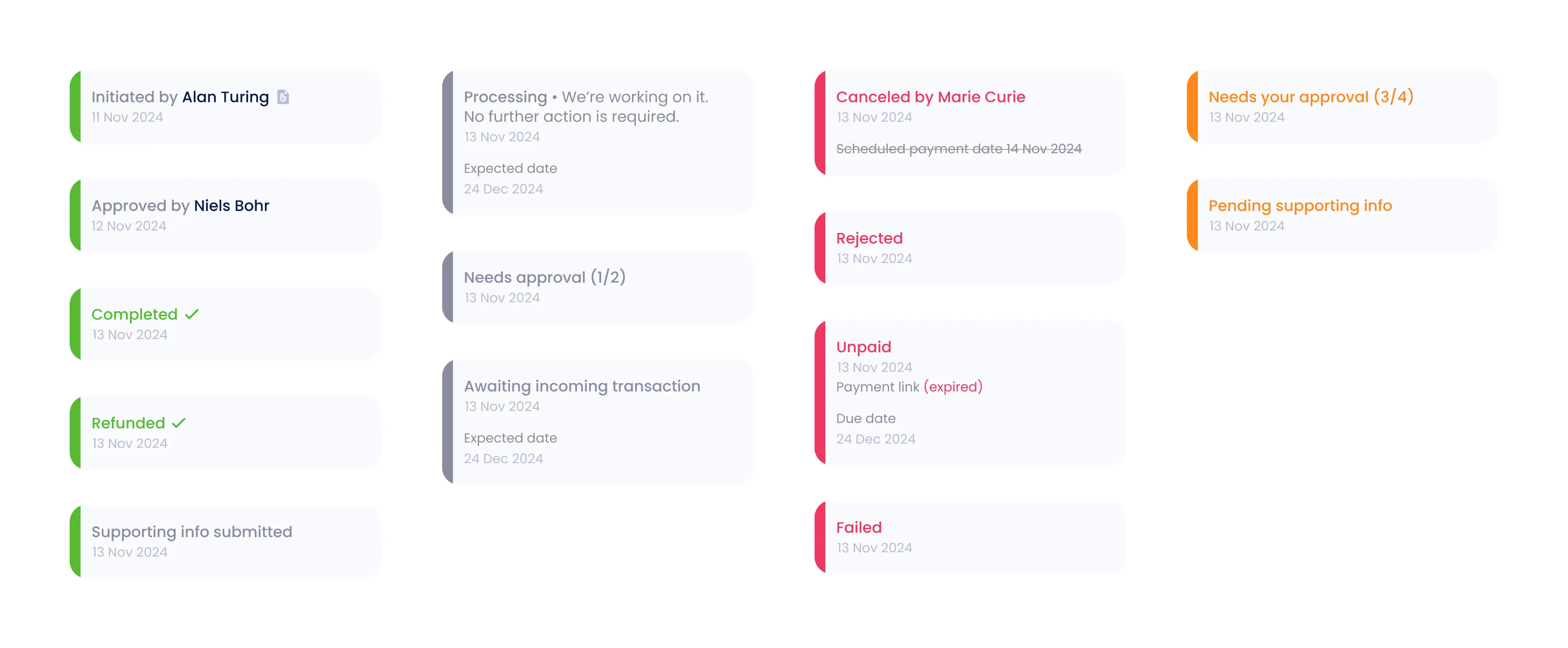
- 5 Transaction timeline
Transaction details are now presented as a timeline that shows each payment’s history and current status. Over 40 statuses were unified into a clear, readable structure.
- 6 UX improvements and microinteractions
Interface details and microinteractions were refined to make the experience feel smoother and more polished. Subtle animations and consistent visual cues enhance the sense of quality and trust.
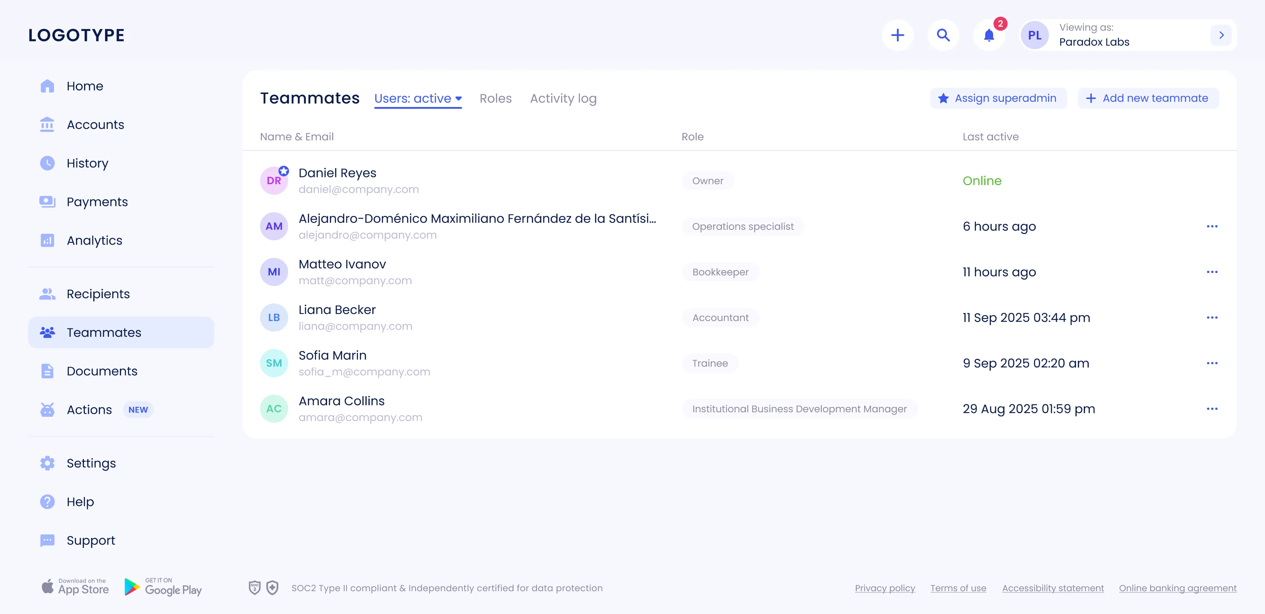
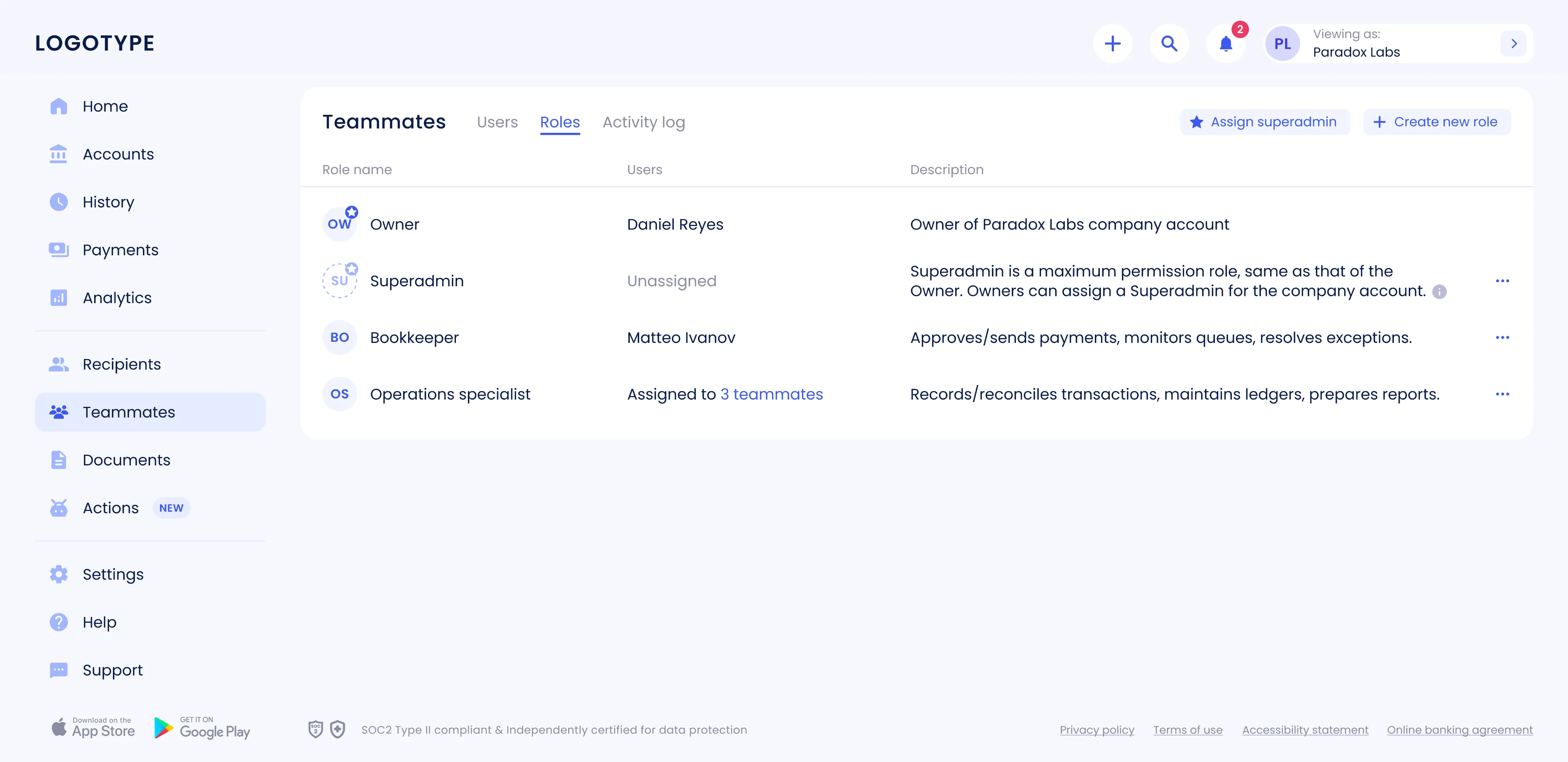
Teammates module
The Teammates section was designed and launched from the ground up, introducing a flexible role-based model. Navigation, actions, access rights, and all key scenarios were carefully thought through to make collaboration secure and intuitive. This update simplified onboarding for new users and introduced clear access control, strengthening both usability and overall product security.
Goal The main goal was to give businesses more flexibility in how they delegate authority. Core scenarios had to be designed: inviting colleagues, assigning roles, configuring access, and managing approvals. Bringing all of these into a unified, scalable design solution was key to keeping operations efficient and costs under control.
Result The new module now includes a transparent role-based model that lets owners and super-admins delegate rights with confidence. Contextual permissions and clear setup steps ensure that no one can use the product until access and limits are properly defined. As a result, key processes became faster and more intuitive. Owners can invite teammates, assign roles, manage access, and set up approval rules for different operations.
Personal challenge The hardest part was creating a scalable role-based model from scratch. It required designing a flexible rights delegation system, contextual permissions, and intuitive setup flows that still fit seamlessly into the overall product structure. Keeping everything consistent with the design system helped speed up development, reduce support costs, and make future updates easier to roll out.
Workflow
- 1 Immersion and research
Work began with gathering input from business and operational teams to define the main scenarios — from user invitations and role creation to access management, approvals, and activity tracking.
- 2 Competitor and market analysis
We analyzed similar B2B products to study their role models, invitation flows, and permission logic. This helped identify best practices and avoid common pitfalls, allowing us to build a simpler and more predictable experience.
- 3 Information architecture
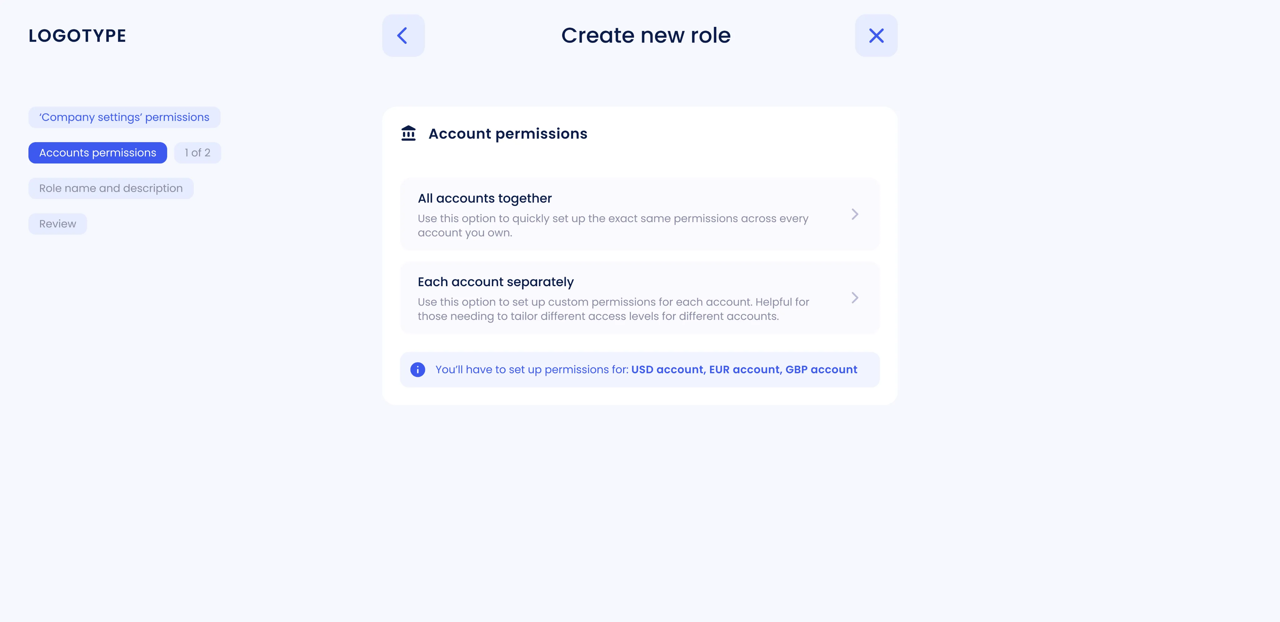
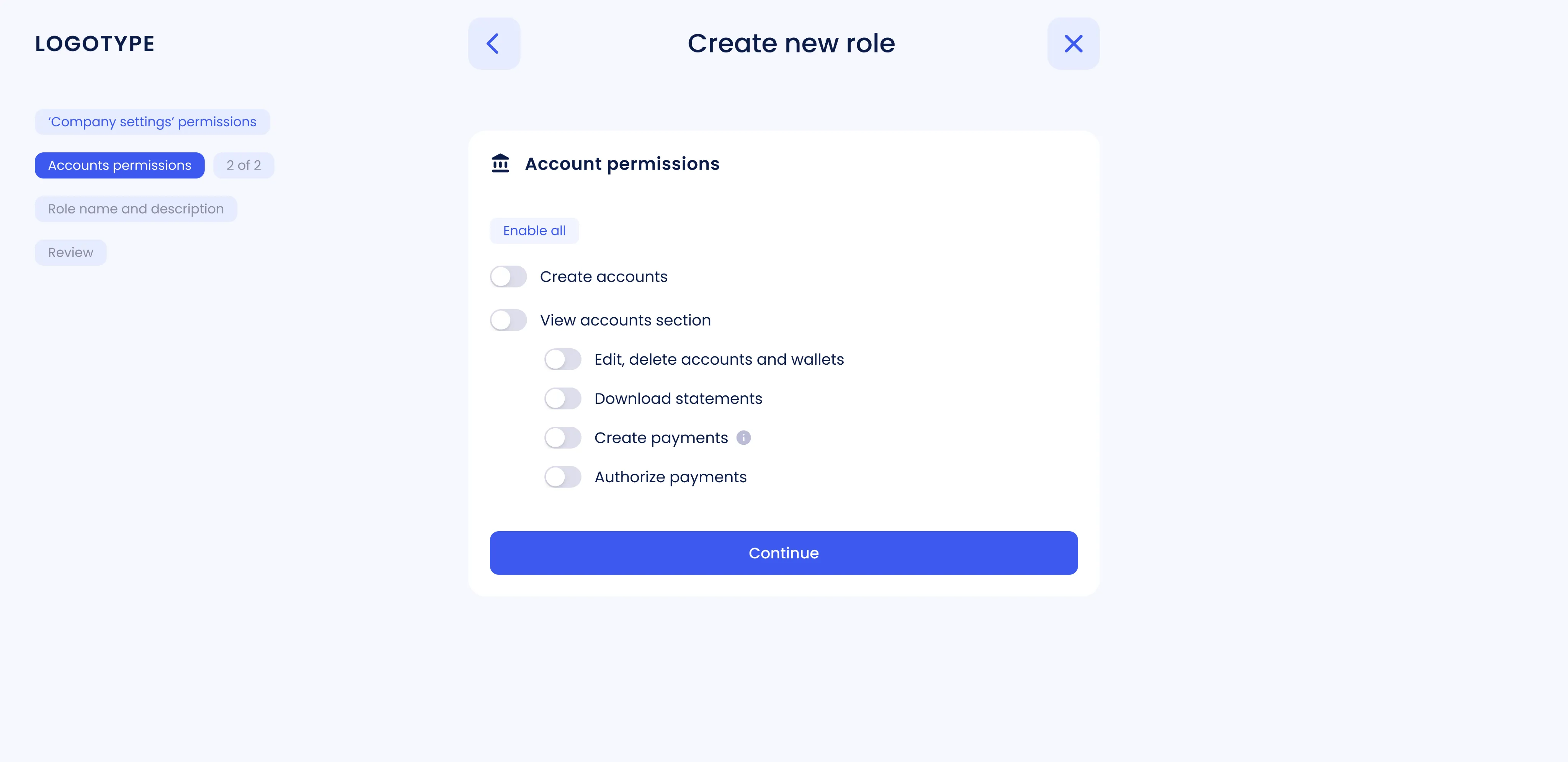
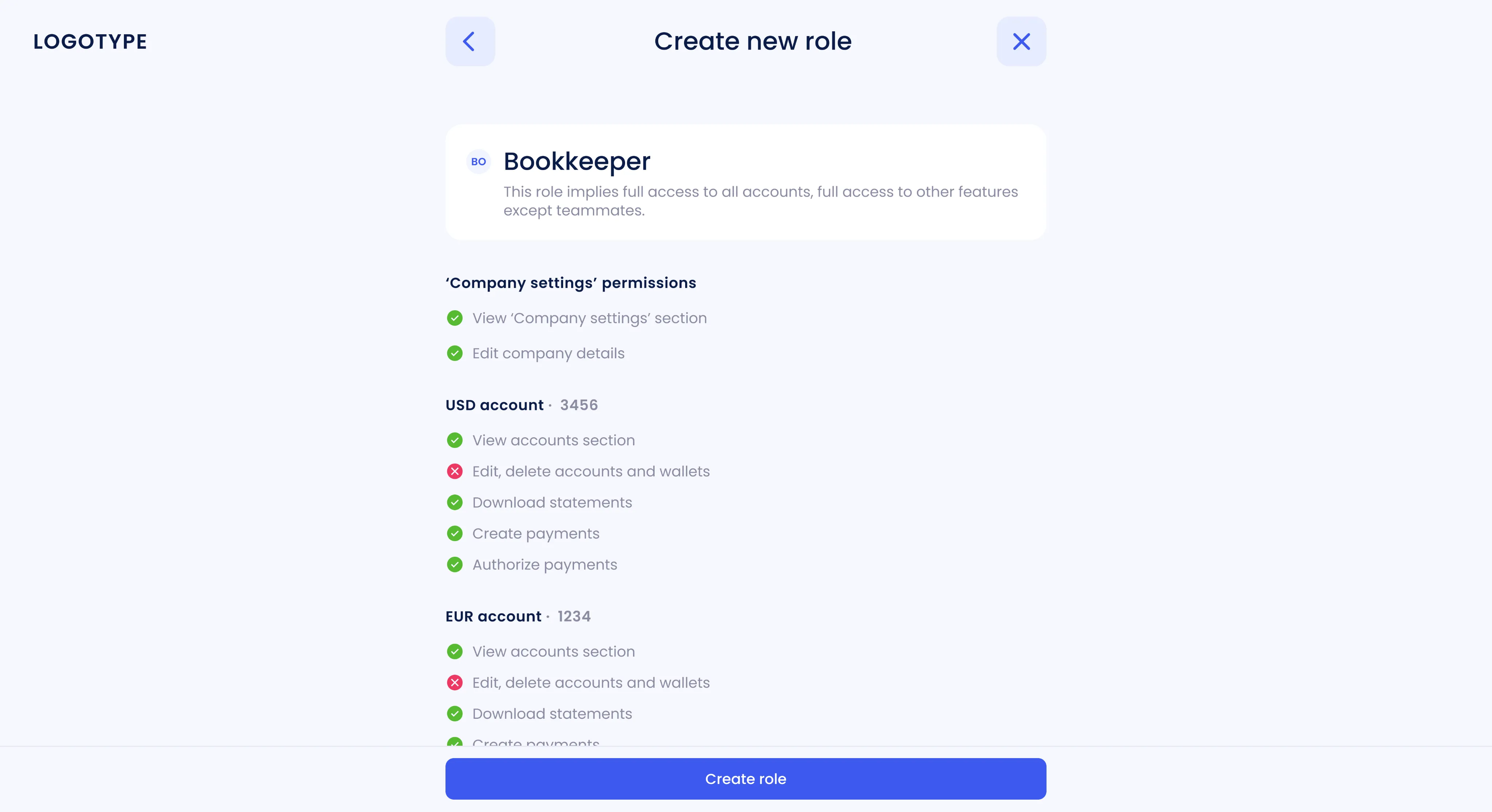
The flow was structured so that an administrator first selects or creates a role, then sets permissions, assigns account access and limits, defines approvers, and, if needed, reviews activity history: keeping the process logical and clear.
- 4 Role model design
A two-level model was introduced: an Owner with full rights and an Employee with limited access. Permission boundaries were clearly defined to prevent unwanted changes or access without explicit assignment.
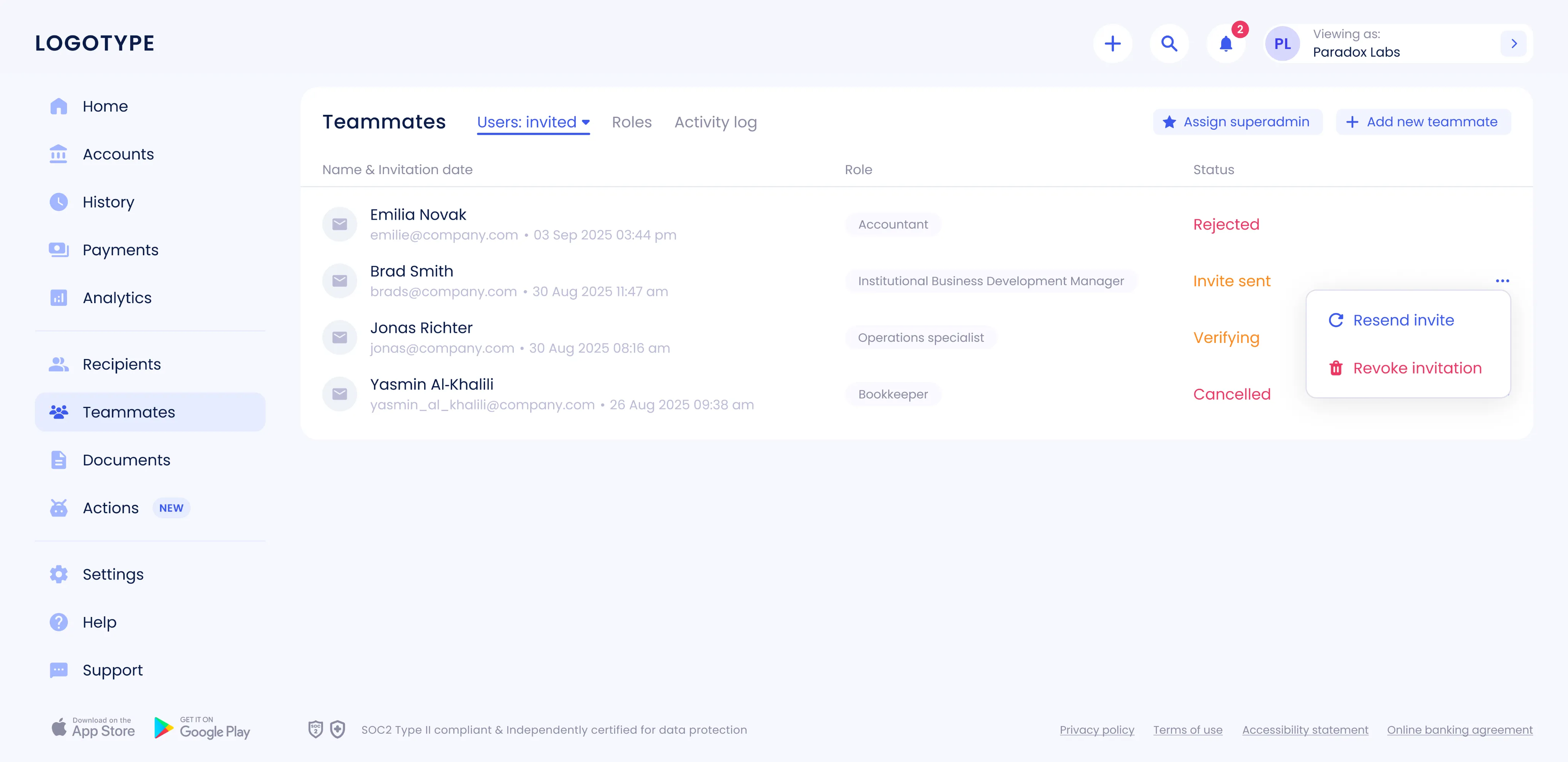
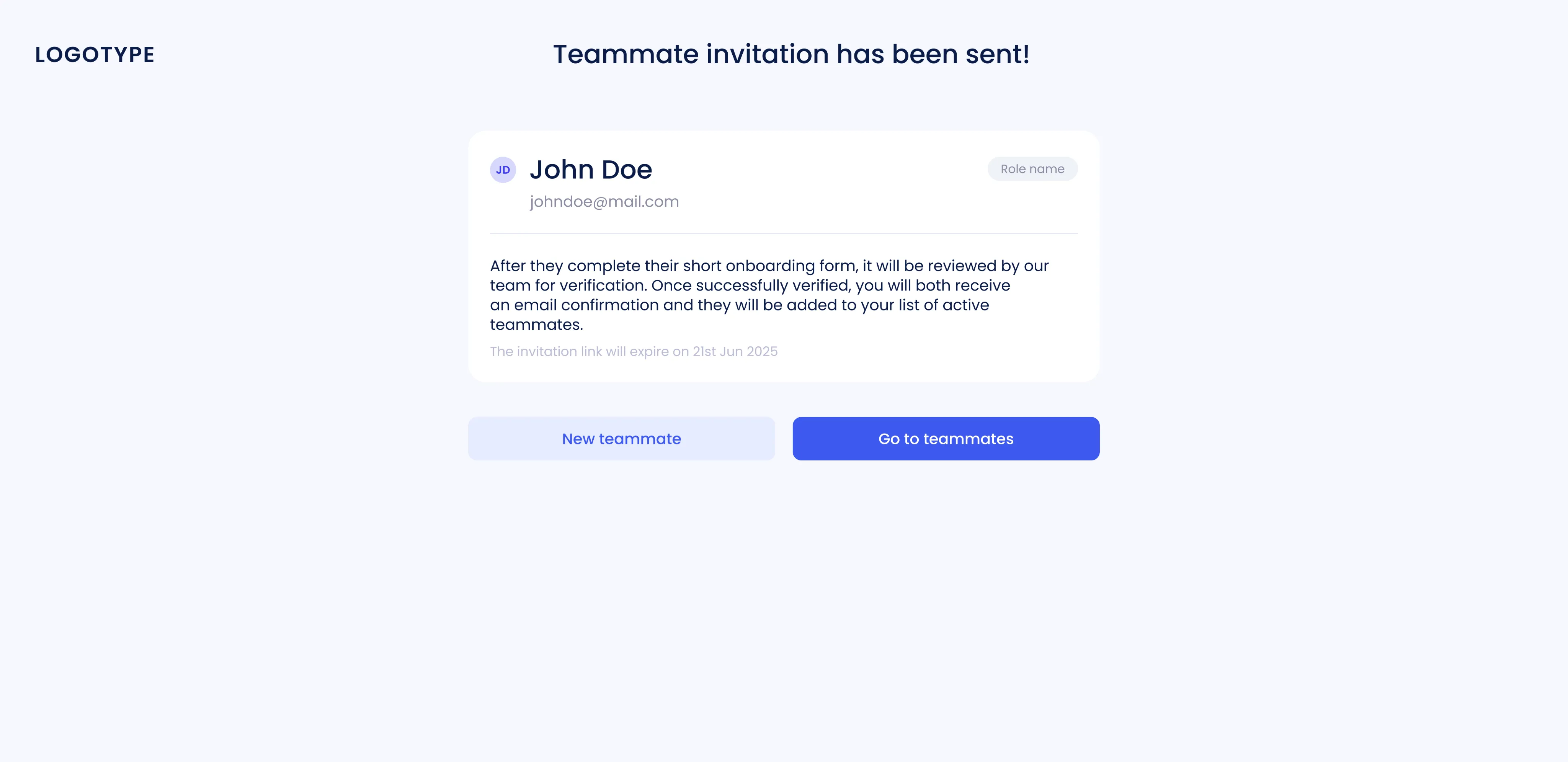
- 5 Invitation flow
The invitation flow was designed around temporary links. Covering invite creation, role assignment, status tracking, and re-sending expired invites. This made onboarding smoother and more transparent.
- 6 Prototyping and testing
Interactive prototypes were created for all main scenarios and tested both internally and with real users. The feedback helped refine edge cases and streamline interactions.
- 7 Design system integration
All new patterns: roles, access tables, invitation statuses, and notifications were added to the design system. Components, tokens, and states (loading, empty, error) were standardized to ensure scalability and visual consistency.
- 8 Edge case handling
Special attention was given to edge cases like permission conflicts, changing roles for active users, and expired invites. This helped ensure predictable and safe system behavior.
- 9 Handover and implementation support
Detailed specs, screen states, and a complete matrix of roles and permissions were prepared. Development was supported through regular design reviews and QA sessions to make sure the final build matched the design intent.
Key screens and scenarios
- 1 Users list and statuses
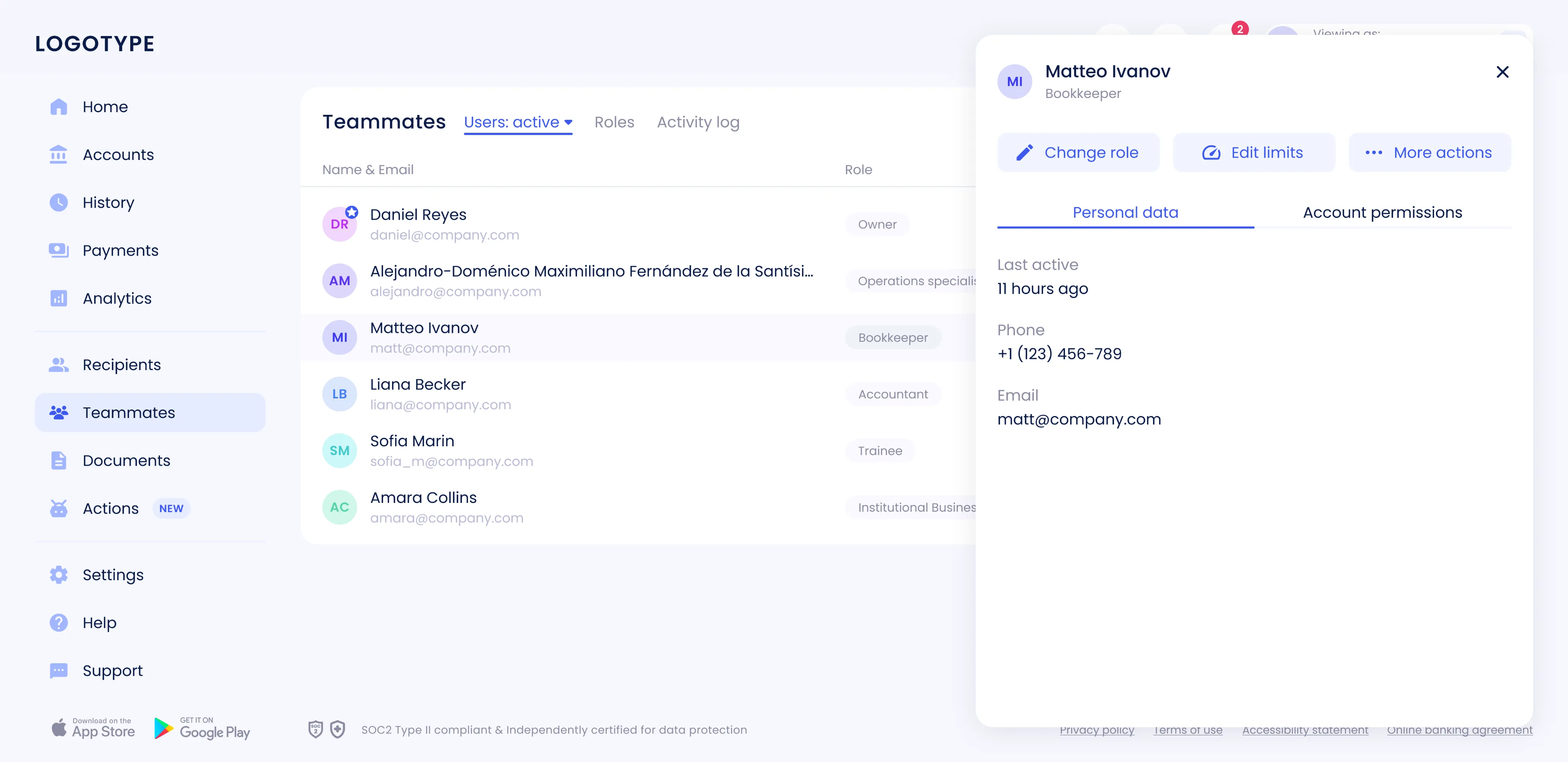
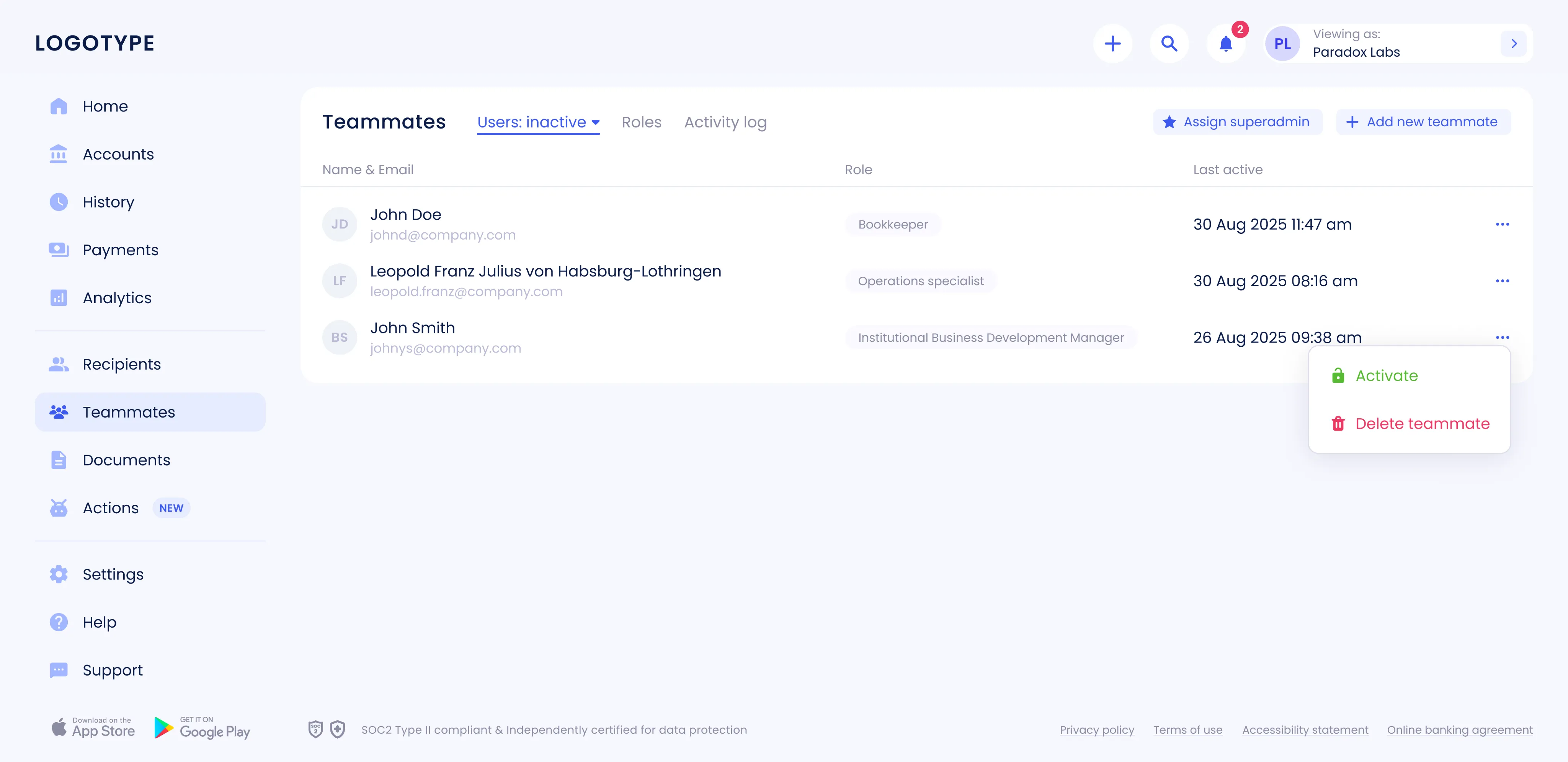
The new Teammates section includes a user list with clear statuses: Active, Invited, and Inactive. Each entry opens a detailed employee card with data and available actions.
- 2 Roles tab
A dedicated Roles tab displays each role’s name, number of users, and description. Owners can create custom roles, edit or delete existing ones, and add new teammates directly from this view.
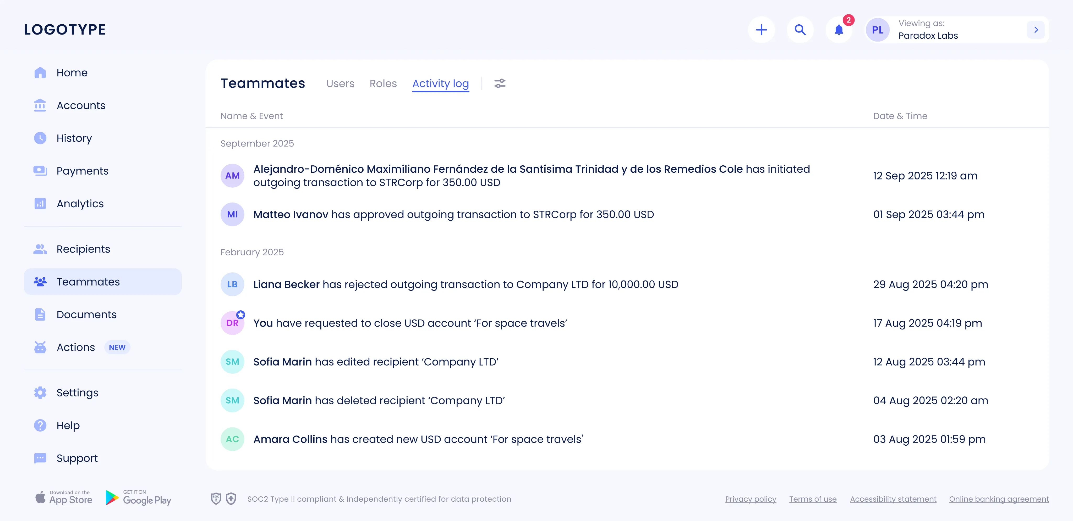
- 3 Activity log
Implemented a centralized activity log with filters by user, event, and date range. The log records sent transactions, additions/removals of recipients, and other key actions.
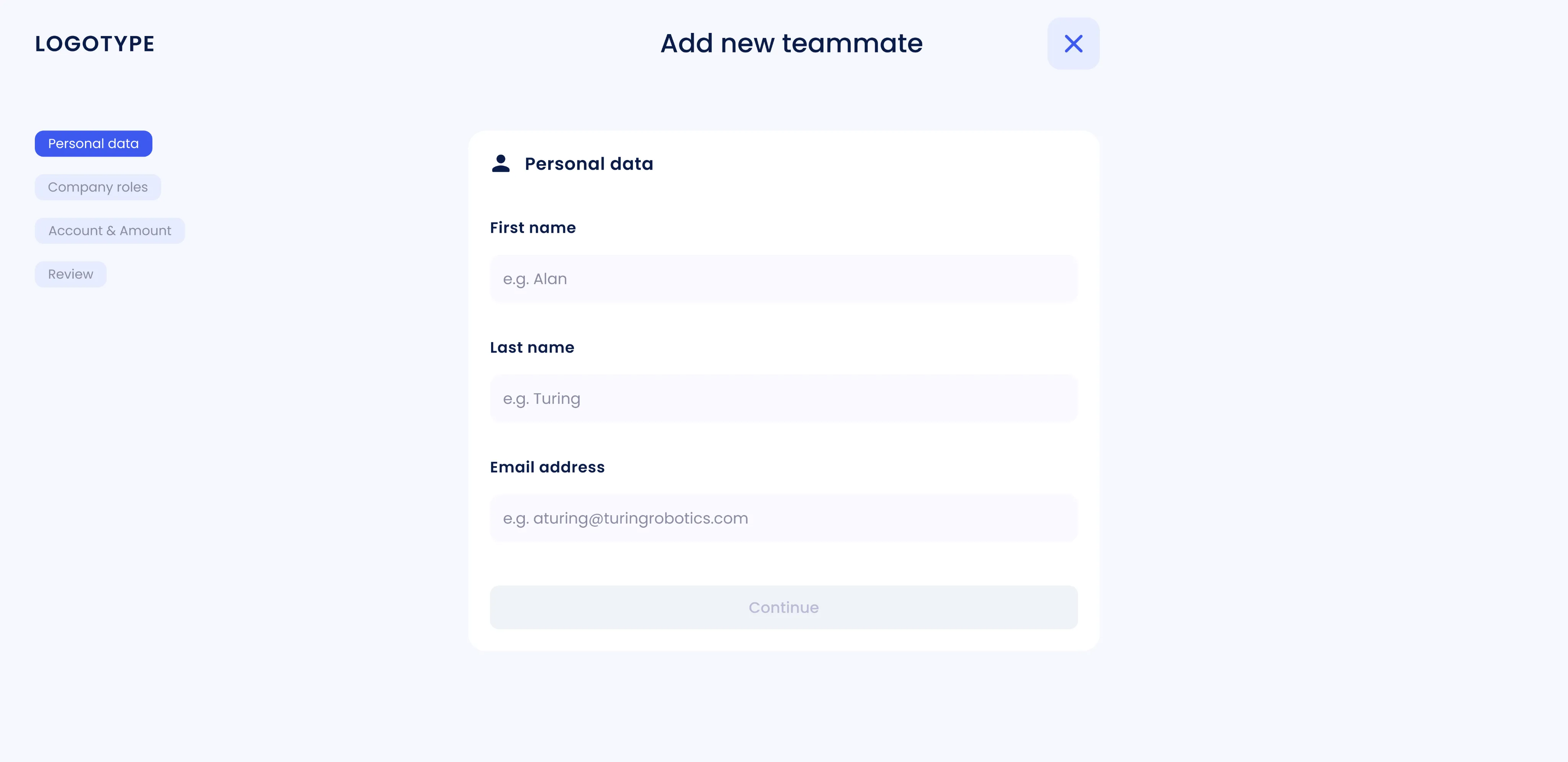
- 4 Add teammate flow
A step-by-step flow was created for adding an employee: entering user data, choosing or creating a role, setting personal limits, reviewing parameters, and confirming the addition.
- 5 Create role flow
Creating a new role starts with configuring permissions (like account access and payment approval), followed by naming and describing the role. A final review step ensures everything is correct before saving.

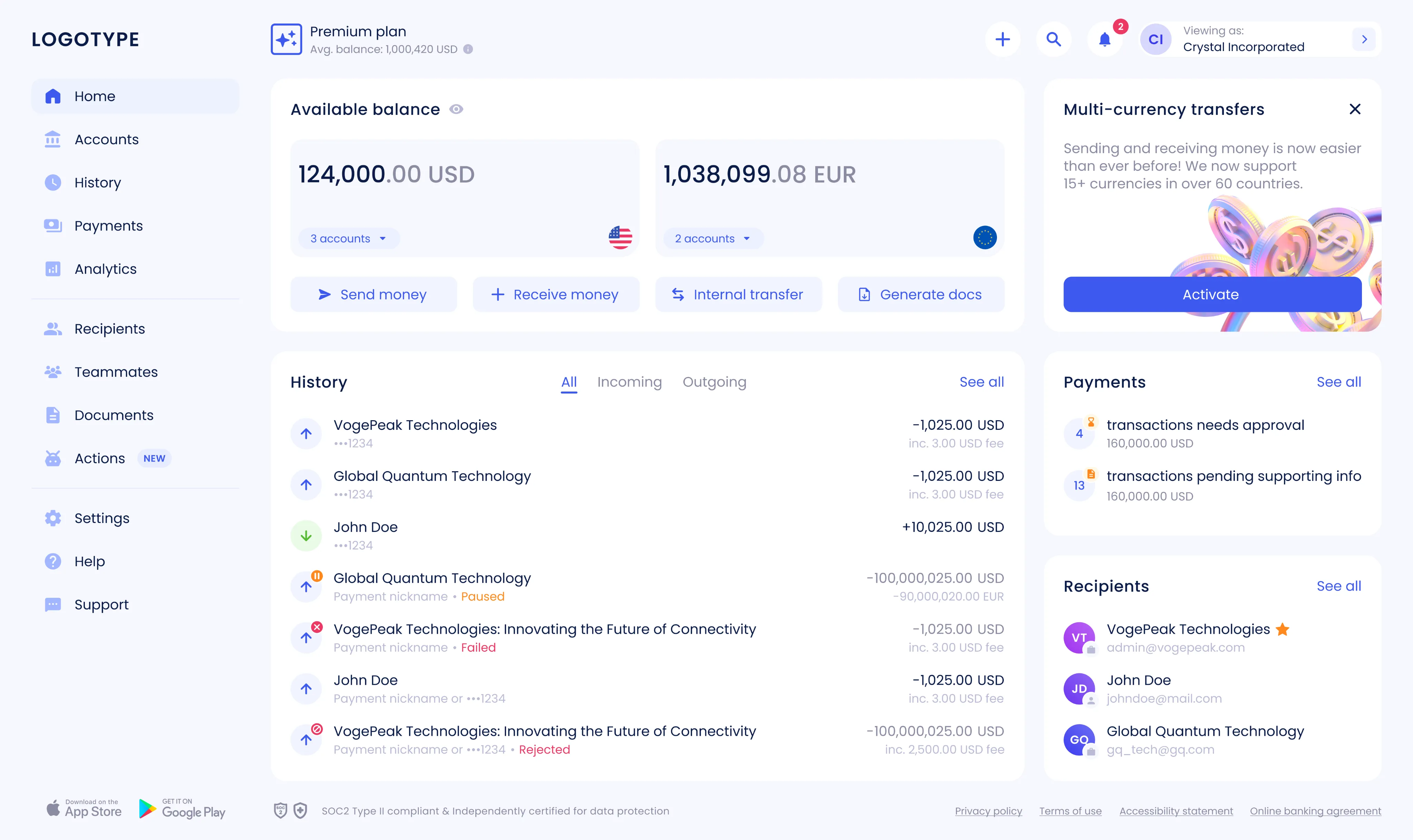
Dashboard redesign
I led a full redesign of the dashboard: rethinking how users navigate, find key data, and perform daily actions. The goal was to make the interface cleaner, more focused, and easier to scale. Along the way, we introduced modular widgets, standardized their structure, and added variables to the design system. As a result, the dashboard became more consistent and flexible, and new features started rolling out much faster.
Goal The redesign came at a time of rapid company growth and a shift in positioning. We needed a product that felt modern, easy to use, and ready for expansion. The main goals were clear: improve the user experience, simplify everyday interactions, refresh the design system, and set the stage for business growth.
Result Due to an NDA, I can’t share specific numbers, but the impact was clear. Core user flows became faster and more intuitive, and the dashboard turned into a real workspace instead of just a data screen. The new design system made it easier to release features, cut maintenance costs, and scale navigation and components without friction.
Personal challenge One of the toughest parts was rebuilding the product while creating a scalable design system from scratch. That meant revisiting a complex component library, unifying patterns, and introducing variables. Every screen had to be carefully migrated to keep things consistent across different user flows and product areas.
Workflow
- 1 Discovery and analysis
We started by collecting feedback from users, stakeholders, and support teams. Then I reviewed analytics and ran a UX audit to understand where people struggled — from navigation and hierarchy to content density and visual clutter. This helped highlight key issues and scaling limits.
- 2 Defining goals and constraints
Together with the team, we set clear goals: make the product easier to use, support new business cases, improve scalability, and align the interface with the updated brand.
- 3 Developing and validating hypotheses
We outlined redesign hypotheses and validated them step by step, keeping technical and organizational constraints in mind.
- 4 Design and prototyping
I rebuilt the information architecture and navigation model, then created interactive prototypes of the main screens and widgets to test complete user journeys.
- 5 Validation and iterations
We tested concepts internally and with real users. After several feedback rounds, we refined the solutions and finalized the design system, key patterns, and tokens.
- 6 Handover and support
All components and specs were delivered in Figma. I stayed involved through design reviews and QA, making sure the final implementation matched the vision. The system continues to grow with new widgets and features.
Design solutions
- 1 Navigation and information architecture
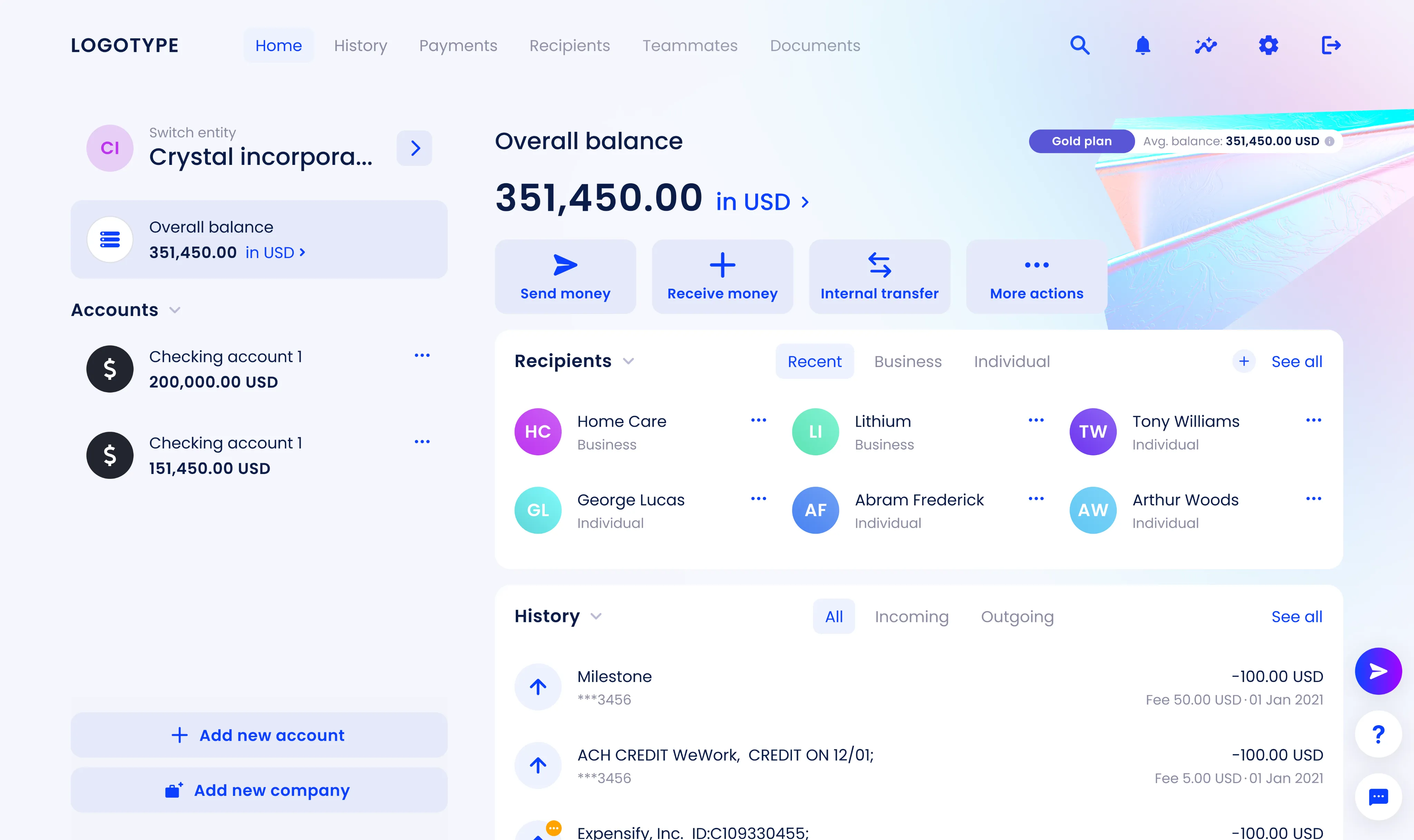
The horizontal menu moved to a left sidebar, it made navigation more scalable and gave users a clear starting point. Removing the illustration freed up space for widgets that could expand without breaking the layout. Accounts got their own section: the dashboard now focuses on summary data and quick links, while details live on separate pages. Company switching was moved to the top-right corner, right where users expect it.
- 2 Typography
The text hierarchy was simplified and spacing standardized, which made everything easier to read and scan.
- 3 Widgets
- Payments: added an informative widget with key metrics and quick actions.
- Available balance: introduced multi-currency support with clear labels and consistent formatting.
- Recipients: redesigned based on usage data, improving overview, search, and quick access.
- 4 Status model
Updated the status model to reflect the user’s onboarding stage more accurately. A total of seven statuses were revised.